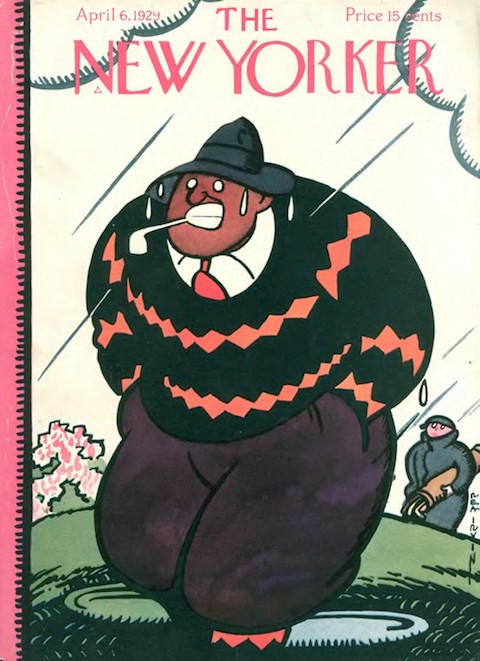
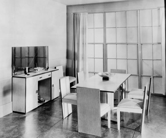
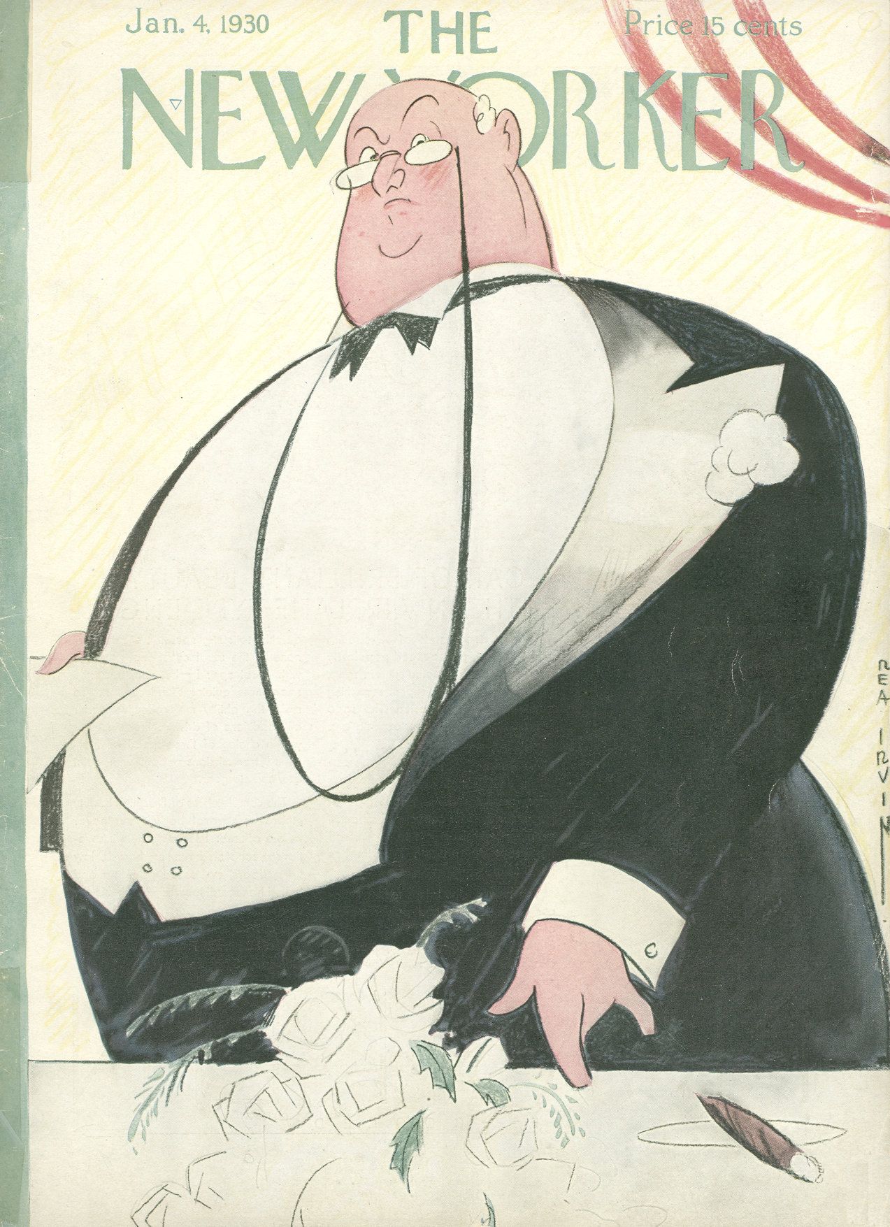
The imposing of image of a fat, fearsome banker greeted readers of the Jan. 4, 1930 issue of The New Yorker, an apt symbol for the dawn of a new decade in a country whose fate seemed wholly in the hands of the old moneymen.
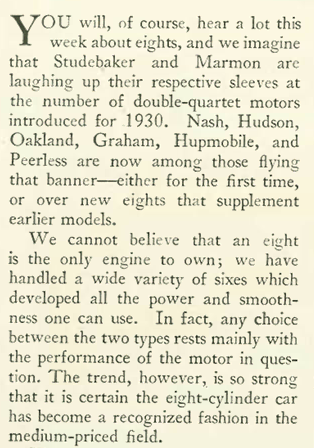
However bleak the outlook, the show still had to go on, and automakers did their best to entice crowds to the National Automobile Show at the Grand Central Palace. The New Yorker’s Nicholas Trott wrote of a “tentative modernism” on display at the show as automobile styles continued to transition from “horseless carriages” to something that looked decidedly modern. Trott’s column, illustrated by Peter Arno…

…made note of the modern angles of Art Deco that were creeping into the designs…


…Trott also noted the increasing popularity of eight-cylinder cars (as evidenced in ads featured later in this blog post)…

* * *
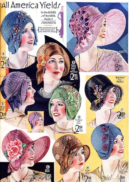
Flappers Get Flappy
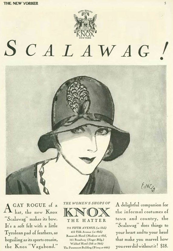
Automobile designs weren’t the only changes seen on the streets of New York. In “Notes and Comment,” E.B. White lamented the introduction of “ear flaps” on women’s hats…

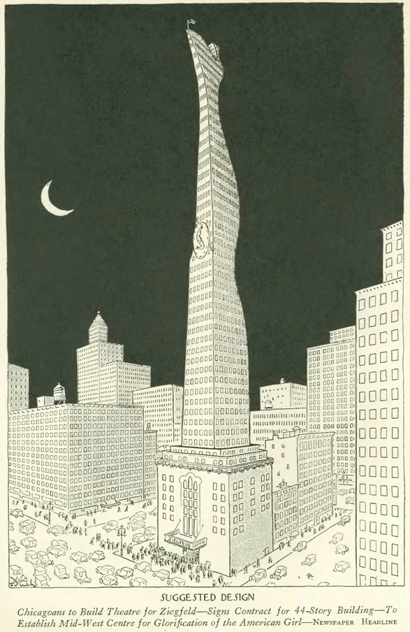
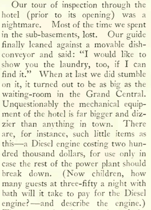
…while on the other hand, in “The Talk of the Town” White welcomed the addition of a namesake hotel to the New York skyline…
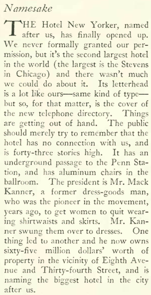

…White noted that the “New Yorker” name seemed to be popping up everywhere…


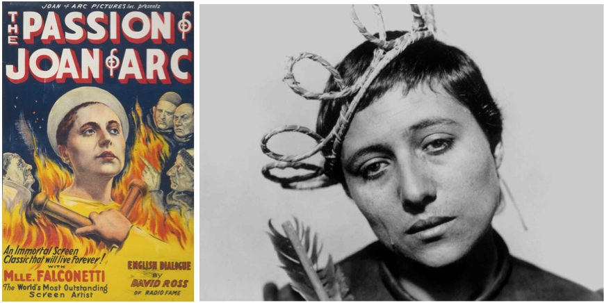
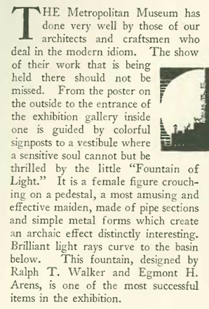
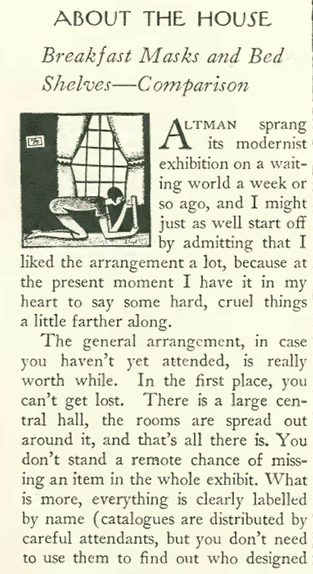
Ways of Seeing
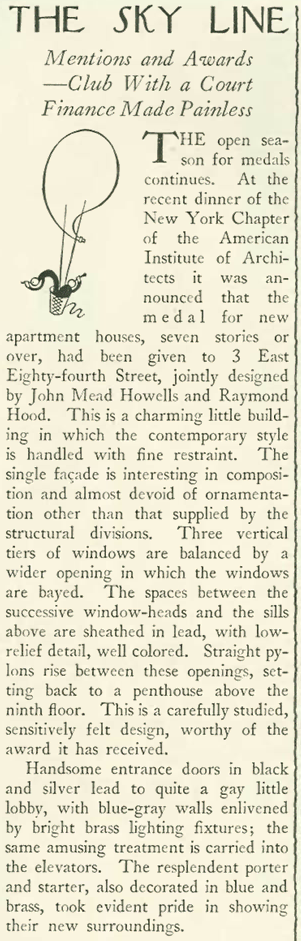
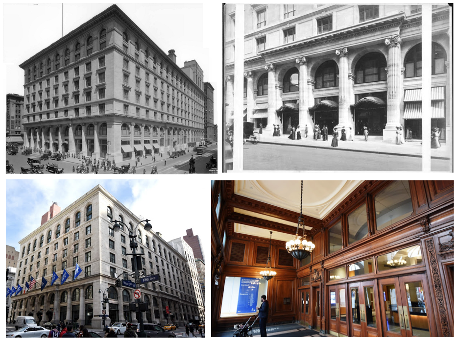
Art critic Murdock Pemberton (1888-1982) continued to ponder the meaning of the new Museum of Modern Art, which was staging its second-ever exhibition in its galleries on the 12th floor of the Heckscher Building on Fifth Avenue:

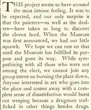
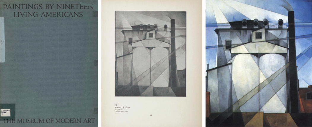
No doubt Pemberton, who came from humble Kansas roots, found it difficult to warm up to a gallery founded in November 1929 by three society women — Mary Sullivan, Lillie Bliss and Abby Rockefeller…
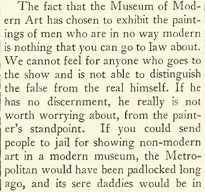

…and wryly suggested that perhaps another museum could be founded, “The Modernest Modern Museum,” for those who lacked clout or patronage with MoMA’s well-heeled board of directors…

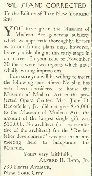
Pemberton’s grumblings caught the attention of Alfred Barr Jr., the first director of the Museum of Modern Art, who sought a correction (printed in the back pages of the Jan. 4 issue) regarding some of Pemberton’s earlier observations of the museum. No doubt Barr was feeling some Rockefeller heat as well:
For some insight into Pemberton’s populist views (the old meaning of the word, not the new one), the critic’s granddaughter, Sally Pemberton, had this to say in a 2012 New Yorker interview:
“Being from humble roots in Kansas and having worked to help support his family since he was a young boy, Murdock had a love-hate relationship with the upper echelon of society. He visited “plush hung galleries” and saw how museums treated art and artists in the nineteen-twenties and thirties, and he wanted art to be more accessible. He asked that the Met set aside a room for the work of living artists. He called for art to be displayed in libraries and universities, and in some cases to be sold in department stores. He wrote about what a wonderful thing it was when the W.P.A. put murals in post offices around the country and how that changed the American public’s perception of art.”
Ms. Pemberton is the author of Portrait of Murdock Pemberton: The New Yorker’s First Art Critic.
* * *
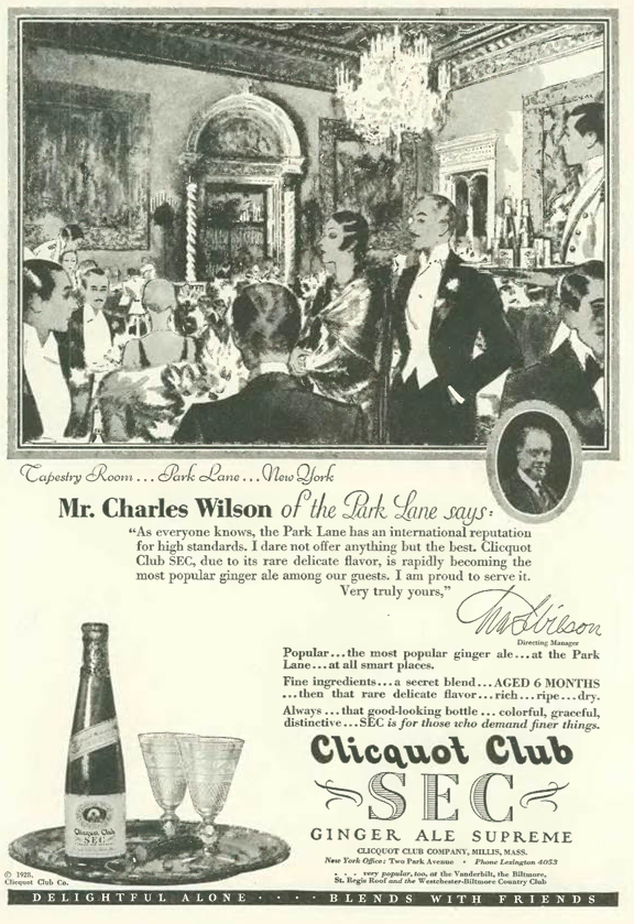
From Our Advertisers
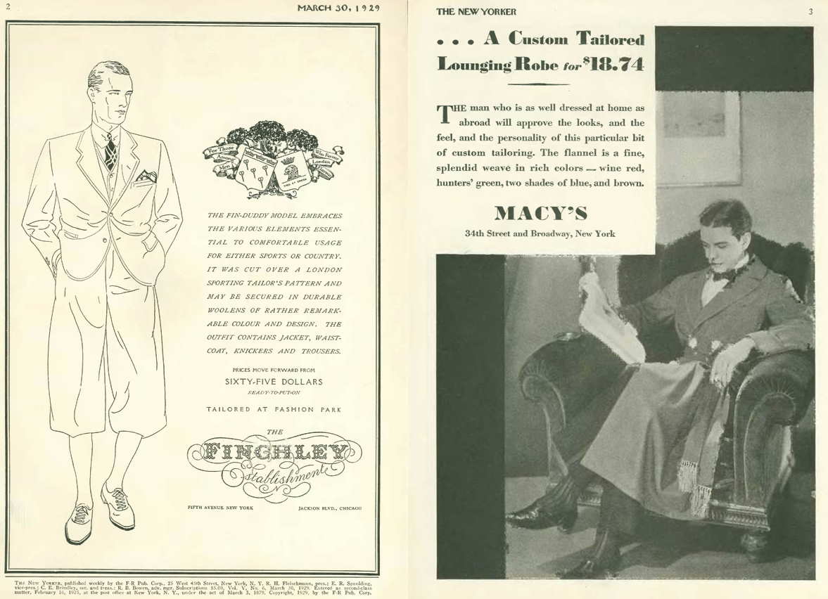
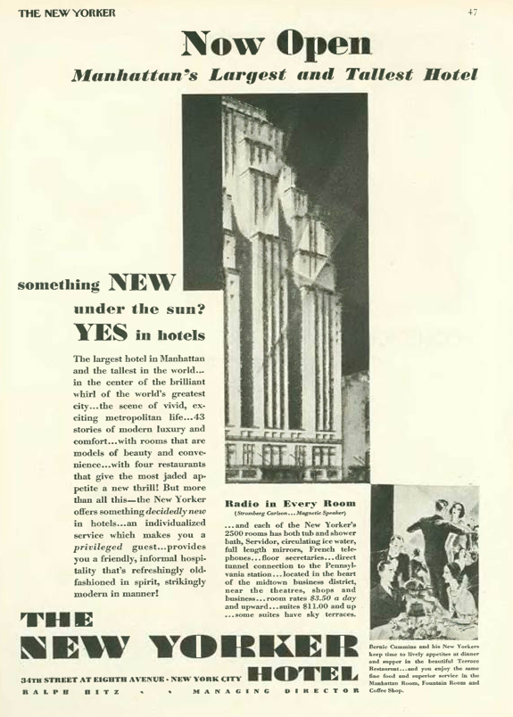
More ink for the newly opened Hotel New Yorker in this advertisement on page 47…
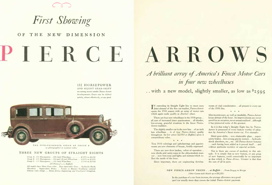
…and with the automobile show in town, the magazine was filled with numerous splashy car ads…Franklin with its air-cooled engine, Hupmobile with its powerful eight, and Pierce-Arrow—America’s answer to Rolls Royce—would all fall victim in the 1930s to the Great Depression…


…the magazine also featured numerous ads beckoning the well-heeled to warmer southern climes, including society snowbirds seeking respite at Palm Beach…

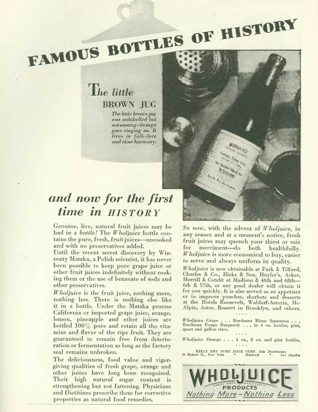
…this ad from Flit (drawn by Dr. Seuss) seemed to recall the old filler joke from the first issues of The New Yorker, a riddle told backwards:
POP: A man who thinks he can make it in par.
JOHNNY: What is an optimist, pop?

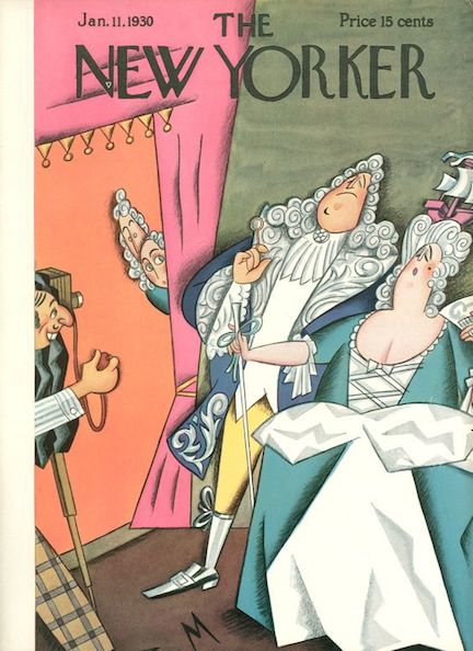
…Peter Arno offered his talents in this illustration for the theater review section…
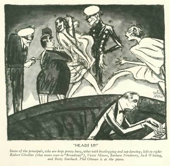
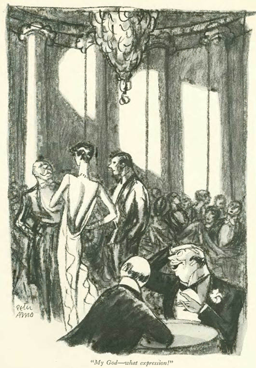
…and this cartoon peek into society night life…
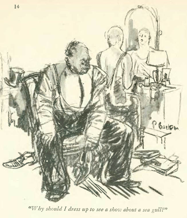
…glimpses of domestic life were provided by Perry Barlow…
…Garrett Price…

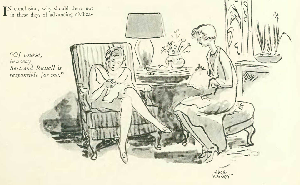
…Alice Harvey…
…and Leonard Dove…

Next Time: A Backward Glance…