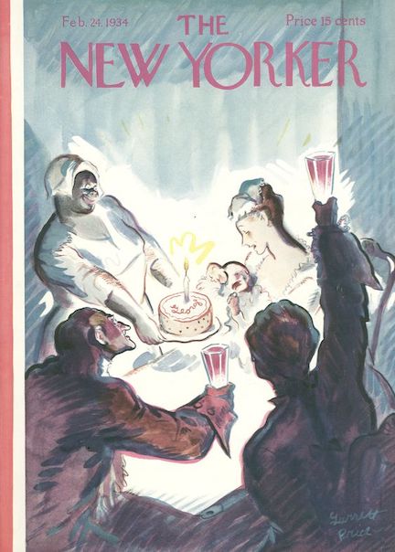
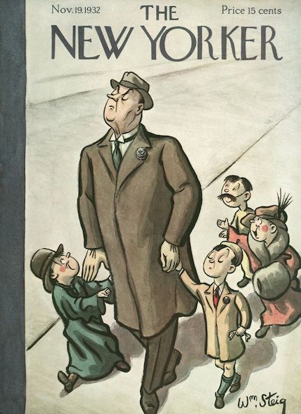
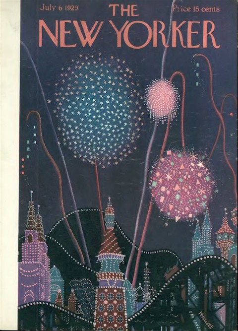
Above: It took a few issues for the editors to sort out regular features and their order of appearance. The opening section of Issue No. 1 featured the famous Rea Irvin masthead that would introduce “The Talk of Town” for many issues to come. In Issue No. 1, however, “Of All Things” appeared first under the masthead, followed by “The Talk of the Town." Let us hope the magazine restores the original Rea Irvin masthead for its 100th anniversary.
Despite the lingering Depression The New Yorker entered its ninth year on strong financial footing. With nearly equal numbers of subscribers and single copy sales, circulation would approach 125,000 in 1934, with more than $2.2 million in advertising income.

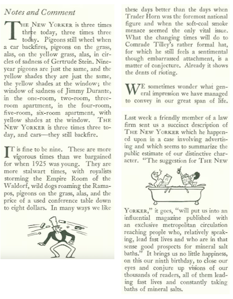
In his “Notes and Comment,” E.B. White commented on the “more vigorous times” the magazine was enjoying, declaring “it is fine to be nine.”
* * *
Daffy Dilettante
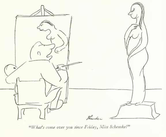
Another Algonquin Round Table crony, Harpo Marx, was a skilled artist when it came to comedy, pantomime, or the harp, but when he decided to take up a brush and palette he struggled to properly paint a female nude. In this account from “The Talk of the Town,” Harpo eventually abandoned his painting and switched places with the model.


* * *
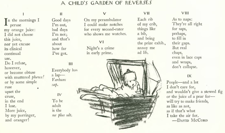
Ode to Faraway Lands
A renowned author of children’s poetry, David McCord (1897-1997), was also a frequent contributor to The New Yorker for thirty years (1926-56). For the Feb. 17 issue he penned these sonnets to the Baedeker travel guide.

* * *
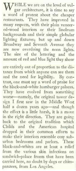
Wimpy Vernacular
Architecture, art and cultural critic Lewis Mumford paused in his criticism of everything from liquor stores to cheap restaurants to offer some surprising praise to his city’s “black-and-white hamburger palaces.”

* * *
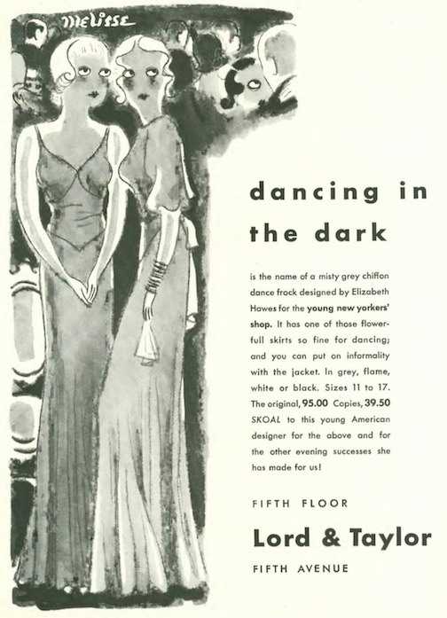
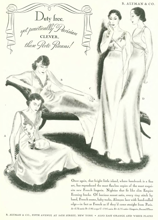
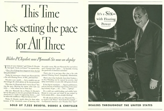
From Our Advertisers
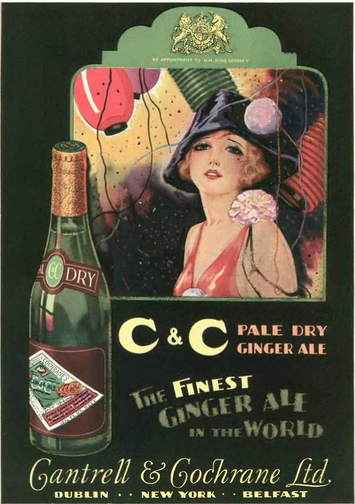
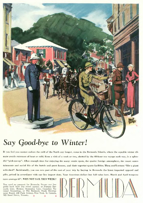
Advertising income reached an all-time high at The New Yorker in 1934, and it showed with the numerous color ads enticing travel to Bermuda…
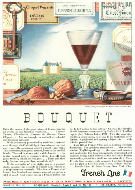
…or to the French wine country…
…Hiram Walker presented their Canadian Club whisky on what appeared to be a cloth napkin…

…artist Hans Flato continued his unusual Ruppert’s Beer series of mannequin people (and dogs) going about their lives stuck to yellow discs…
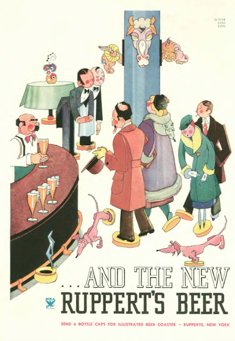
…according to the Ruppert’s ad, for six bottle caps you could get a tin coaster like those pictured below…

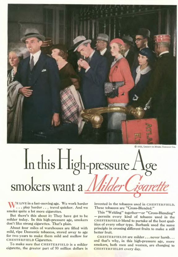
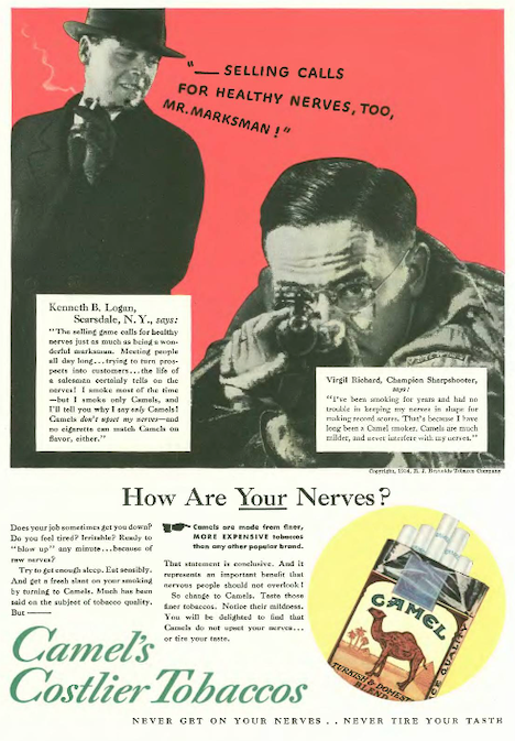
…from magicians and salesmen to sportsmen and high society, the folks pushing Camel cigarettes seemed to try every angle to get their product into the mouths of as many consumers as possible…
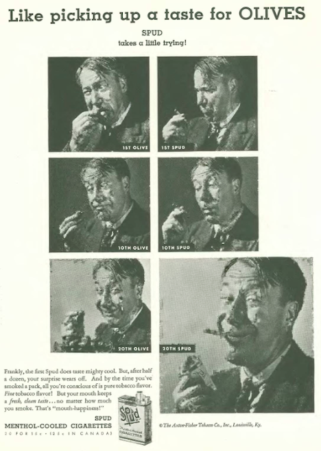
…the makers of Spud menthol cigarettes, on the other hand, tried a little humor to get smokers hooked on their “mouth happiness”…
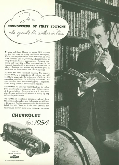
…as one of the world’s most popular car brands, Chevrolet has long been considered a car for the masses, although this ad campaign launched in 1934 suggested that the ubiquitous Chevy was just the car for a connoisseur of the finer things…
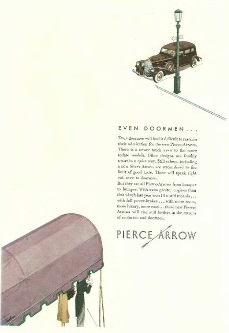
…the staid luxury auto maker Pierce Arrow broke with tradition by placing this very modern, minimalist ad…
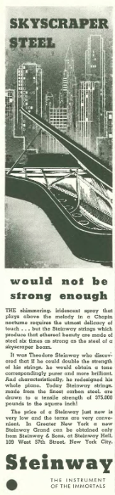
…the folks at Steinway also adopted a modern look with this single column ad touting the durability of their grand pianos…
…The Viking Press took out this full-page ad to announce the publication of Alexander Woollcott’s While Rome Burns, a collection of some of Woollcott’s writings for The New Yorker and other magazines…
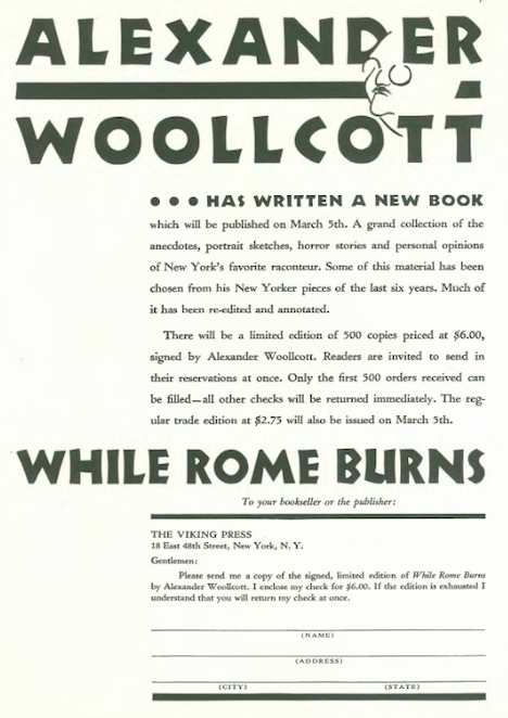
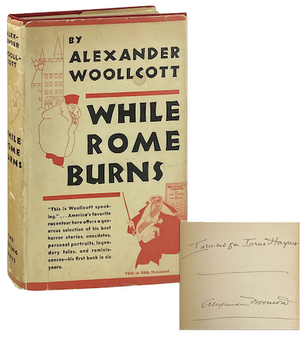
…according to the ad, for six bucks you could get one of 500 limited edition signed copies…as of this writing, the inscribed and signed edition below was available for $350…
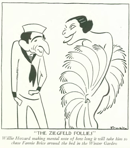
…on to our cartoonists, Al Frueh offered up this interpretation of Ziegfeld entertainers Willie Howard and Fannie Brice…
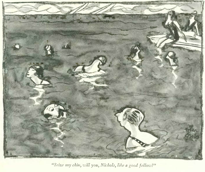
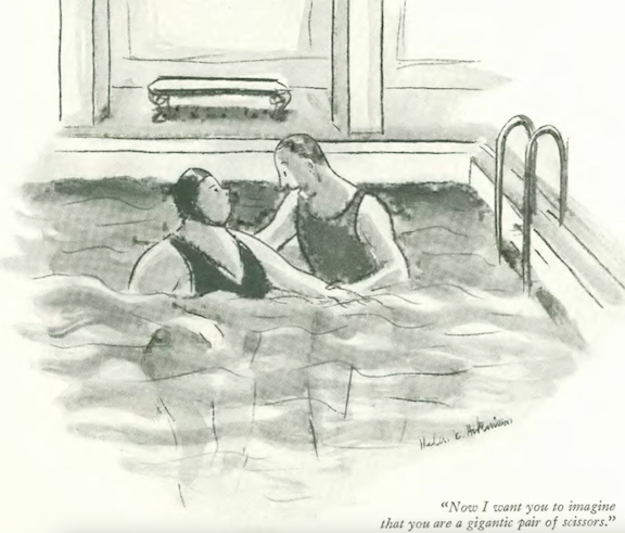
…Helen Hokinson took the plunge with 1930s water aerobics…
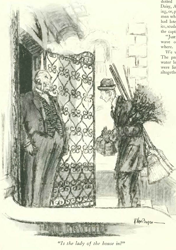
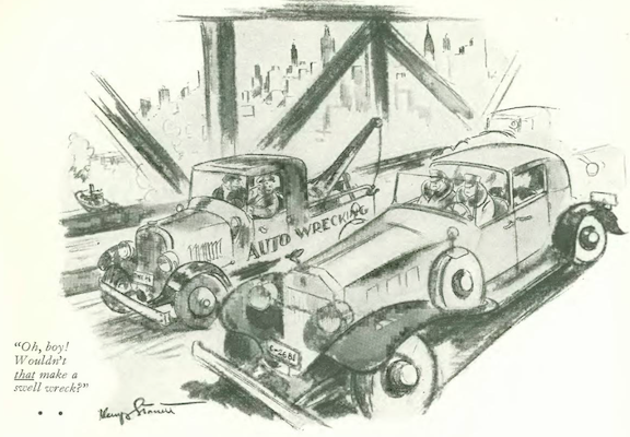
…Kemp Starrett demonstrated how beauty is in the eye of the beholder…
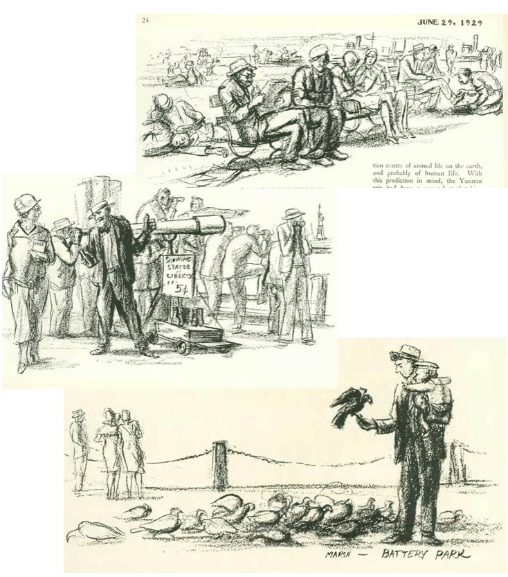
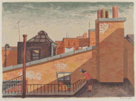
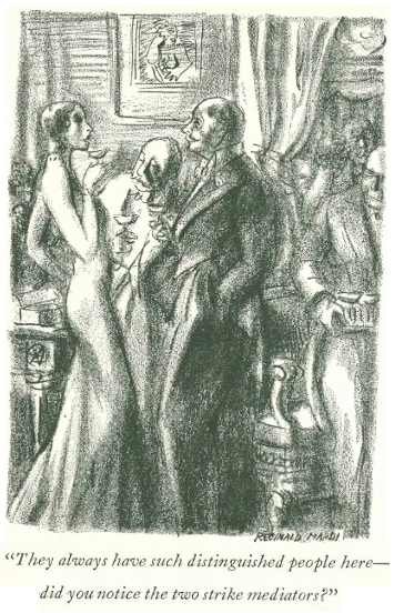
…Reginald Marsh returned, taking temporary leave from life on the streets to look at life above the streets…
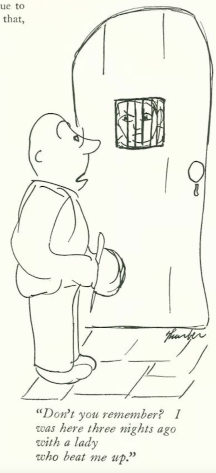
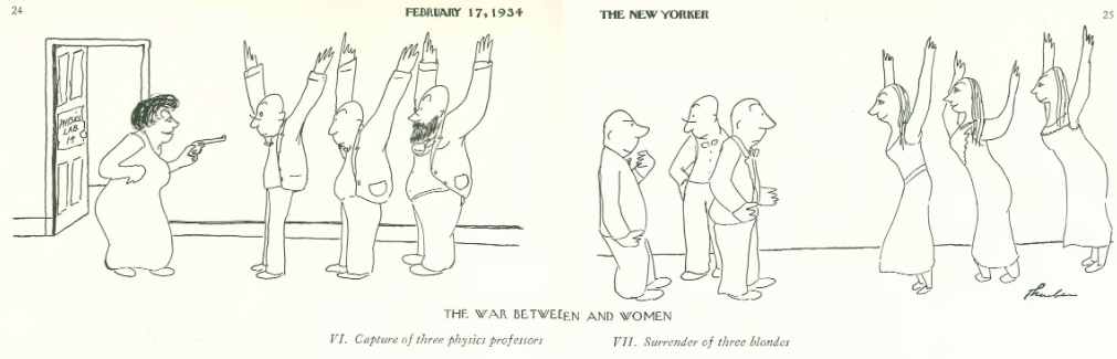
…James Thurber’s “War Between Men And Women” took some new twists…
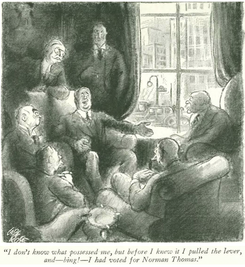
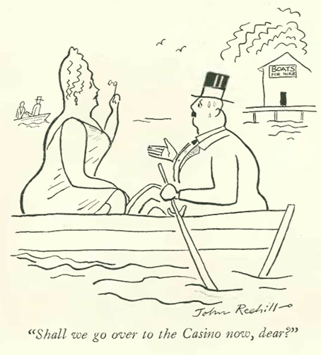
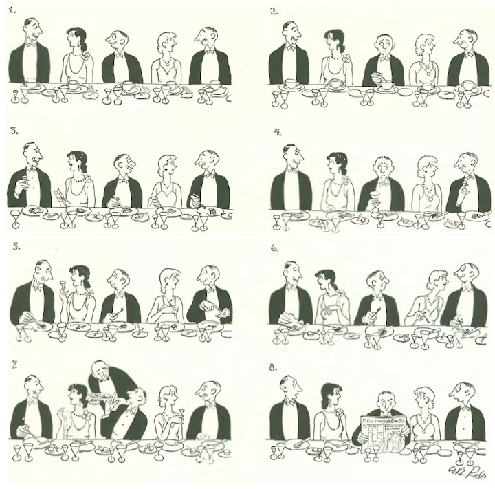
…and we end with Carl Rose, and one man’s solution to being stuck in the middle…
Next Time: Rocky’s Cover-up…