Mutt & Jeff

We close out November 1927 by looking at a hugely popular comic strip—Mutt & Jeff—that made cartoonist Bud Fisher both famous and wealthy.

screen-shot-2017-01-26-at-10-05-52-am
Nov. 19 and Nov. 26, 1927 covers by Rea Irvin.

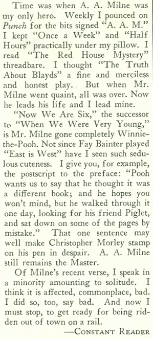
The editors of the Nov. 26, 1927 issue of The New Yorker thought Fisher interesting enough to feature in a lengthy “Profile,” written by Kelly Coombs. A brief excerpt:

screen-shot-2017-01-24-at-1-50-02-pm

screen-shot-2017-01-24-at-1-50-10-pm

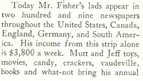
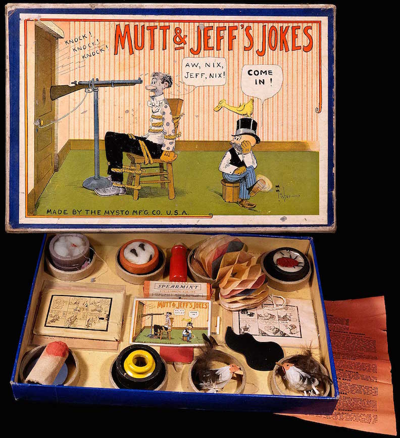
According to John Adcock’s terrific Yesterday’s Papers blog, by 1916 Bud Fisher was the highest paid cartoonist on earth. The New Yorker suggested his annual income was $300,000 (roughly equivalent to more than $4 million today). In addition to the strips, created by Fisher and a team of ghost illustrators/writers, Mutt & Jeff were featured in vaudeville engagements, theatrical shows, animated cartoons, comic books and toys.

muttmagicdark1380
DIE LAUGHING…Mutt & Jeff themed toys included this joke kit from Mysto Manufacturing. I don’t quite get the joke featured on the cover, depicting Jeff’s casually twisted approach to murdering poor Mutt. (Copyright MEL BIRNKRANT via melbirnkrant.com—a truly amazing collection)
m902d5g
IT’S A LIVING…Harry Conway (Bud) Fisher, drawing a likeness of the character “Jeff” at a Chicago Daily News event in 1915. (Chicago History Museum)

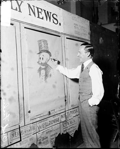
Fisher began his career as a sports cartoonist for the San Francisco Chronicle and started his strip about “two mismatched tinhorns” in 1907. It went into syndication the following year. Mutt and Jeff, originally titled A. Mutt, is regarded as the first American newspaper cartoon published as a strip of panels, making it the first “comic strip.”

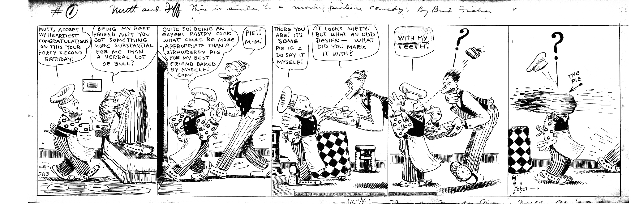
There was obviously a time when American readers thought Mutt & Jeff hilarious, but I don’t quite get its appeal. In this strip from 1926, Jeff gets a pie in the face. The giant question mark was frequently employed by Fisher, as were the dotted eye lines and explanatory arrows like the one in the last panel. No, Jeff didn’t get his brains blown out by Mutt. It is only a pie! Hah!

muttjeff052326b
Click on image to enlarge

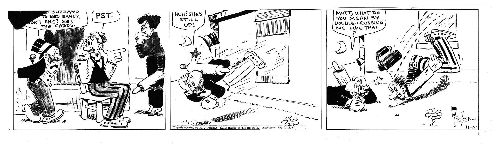
Another visual cliché from comics of yore was the angry wife wielding a rolling pin. Apparently Jeff refers to Mutt’s wife as an “Old Buzzard” and assumes she is already in bed (sorry about the poor quality of the reproduction). Jeff subsequently gets whacked with the rolling pin, and Mutt takes it on the bean with a flatiron. That is quite a feat, throwing a grown man through a window while simultaneously hitting him on the head with a flatiron…

muttjeff112429a
Click on image to enlarge (Both strips courtesy University of Michigan)

The duo were also featured in more than 300 animated “half-reelers” produced between 1913 and 1926, including Mutt and Jeff: On Strike from 1920. The short film (which can be viewed here) even includes rare footage of Bud Fisher himself, since the story–sort of a film within a film–involves the penniless Mutt and Jeff going on strike after they see a movie featuring Fisher’s lavish home.

screen-shot-2017-01-26-at-12-50-34-pm
STRIKEBREAKER…Still images from the silent half-reeler, Mutt and Jeff: On Strike. Bud Fisher is shown at home discussing terms over the phone with his striking characters. They lose. (www.filmpreservation.org)

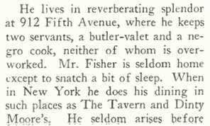
Coombs concluded the profile with these observations concerning Fisher’s personal habits:

screen-shot-2017-01-24-at-1-50-19-pm

screen-shot-2017-01-24-at-1-50-30-pm

Fisher employed a number of assistants on the strip, including George Herriman (Krazy Kat) and a high-school boy named Maurice Sendak (Where the Wild Things Are). When Fisher appeared to lose interest in the strip in the 1930s, assistant Al Smith took over and drew the strip for nearly fifty years (but Smith didn’t sign his own name on the strip until after Fisher’s death in 1954).

In Yesterday’s Papers, Adcock notes that Fisher “was the unlikeliest person you could think of to draw Mutt and Jeff…along with most of his contemporary cartoonist-journalists pals, (he) enjoyed fights, chorus girls, gambling, and saloons. Fisher liked to shoot up hotel rooms with his pistols, one of which was a gift from Pancho Villa, indoors when he was drunk.”
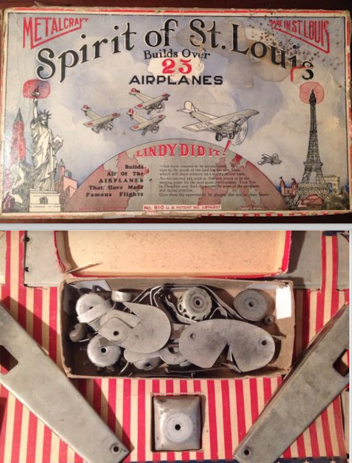
Heads in the Clouds

Thanks to the race to fly across the Atlantic, toy models of Charles Lindbergh’s Spirit of St. Louis and other planes were in high demand for the Christmas season, according to this item in the Nov. 26, 1927, “Talk of the Town:”

screen-shot-2017-01-24-at-1-42-51-pm

screen-shot-2017-01-24-at-1-42-56-pm

screen-shot-2017-01-27-at-9-48-40-am
BUILT TO LAST…A Metalcraft model kit (box, upper image, contents below) from the late 1920s. It was all metal in the days before plastic model kits. (eBay)

 *  *  *

At a Loss For Words

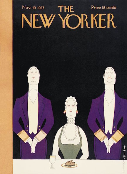
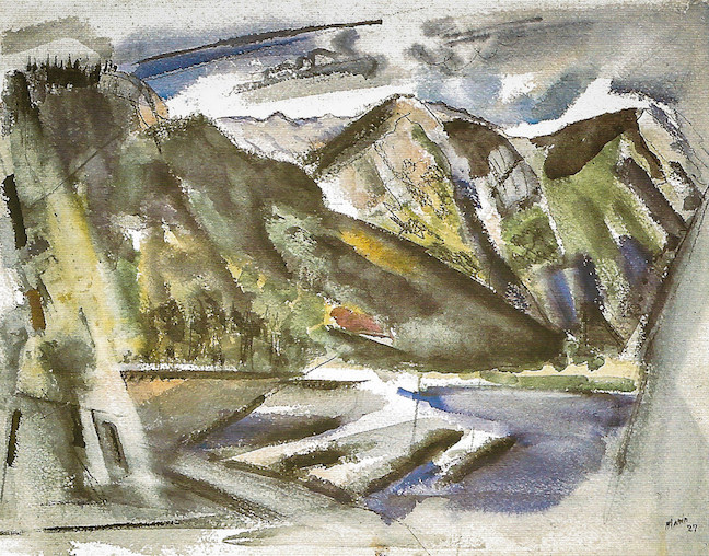
Jumping back to the Nov. 19, 1927 issue, we go from the low art of Bud Fisher to the high art of John Marin featured in “The Art Galleries” section. Art critic Murdock Pemberton wrote:

the-art-galleries-marin-1

screen-shot-2017-01-27-at-10-01-51-am
SAVAGE WORK…John Marin, White Horses – Sea Movement off Deer Isle, Maine, 1926. (Whitney Museum of American Art)

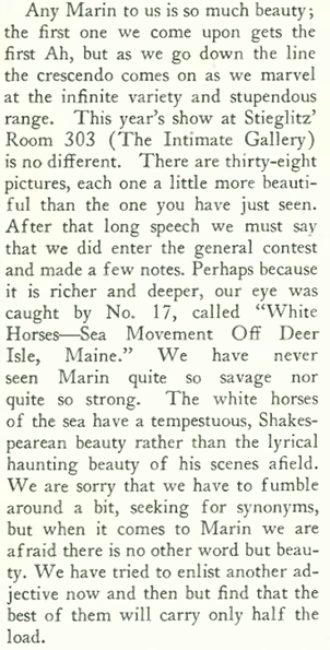
But perhaps “high art” is not an accurate description of Marin’s paintings, since Marin himself wasn’t into “highfalutin words” to describe his work…

marin-2-signed-mp

12032401444_4bb042eb04_b
HAUNTING BEAUTY…John Marin, Echo Lake Franconia Range White Mountain Country, 1927 (National Gallery of Art, Washington DC.)

 *  *  *

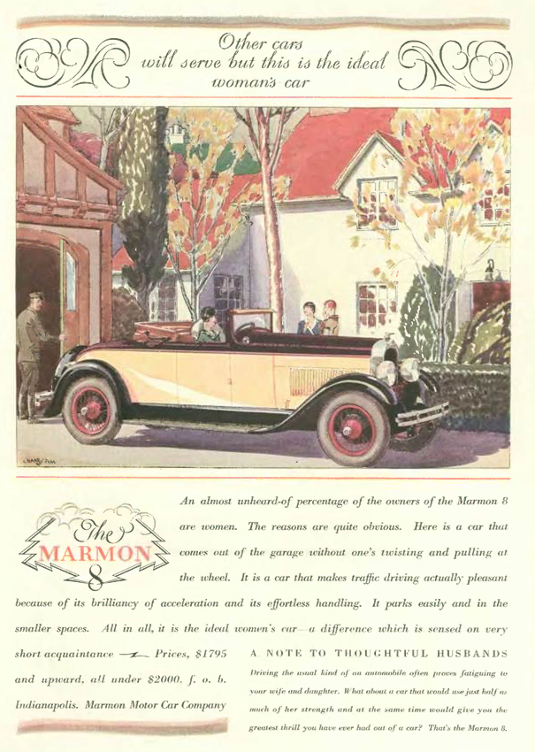
In the previous week’s issue (Nov. 12) the Marmon 8 was advertised as an ideal car for women. Not to be outdone, the folks at Buick shot back with this colorful ad in the Nov. 19 issue:

screen-shot-2017-01-24-at-1-19-18-pm

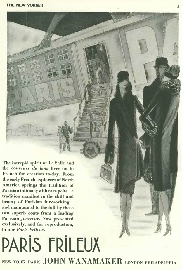
The Nov. 19 issue also featured this strange advertisement from the famed Wanamaker department store. Strange mainly because of the illustration, which features a fashionable woman departing a fanciful aircraft studded with mullioned windows(!) and a stairway that stretches to improbable depths…oh, and in case the reader might miss the snob appeal associated with French furs, the words Paris, Parisian or French are featured ten times…

screen-shot-2017-01-24-at-1-20-53-pm

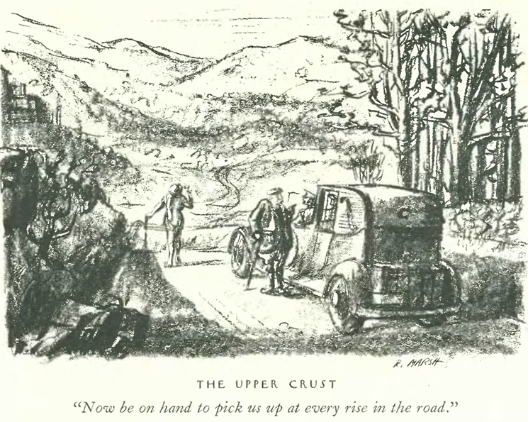
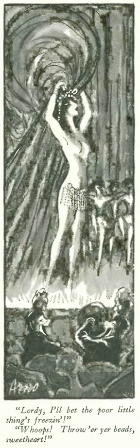
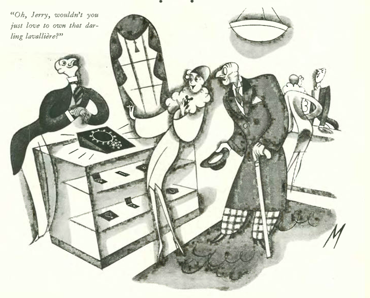
And finally, the ubiquitous New Yorker cartoon featuring the humorous mismatch of rich old sugar daddy and ditzy young mistress, courtesy of Julian de Miskey

screen-shot-2017-01-24-at-1-25-20-pm

Next Time: More Funny Business…

dec-3


The Shape of Things to Come

(Photograph by Flickr user August Fischer)

It is often observed that when we look to the past we can see our the future. More than 90 years ago, Swiss architect Le Corbusier (Charles-Édouard Jeanneret) wrote an influential book on modern architecture, Vers une Architecture (1923) that helped to radically change how we looked at our built environment. Translated into English in 1927 under varying titles (Toward an Architecture, or Towards a New Architecture), the book caught the appreciative eye of New Yorker architecture critic George Chappell, who wrote under the pseudonym “T-Square.”

6a4881d9250d214bed267228a8881e08
Nov. 12, 1927 cover by Theodore G. Haupt.

Given that most new architecture in Manhattan was adorned in architectural stylings from the past, or gussied up in Jazz Age art deco, Chappell was introducing his readers to something very different, to ideas that would transform their city within two generations.

screen-shot-2017-01-19-at-9-10-14-am

screen-shot-2017-01-19-at-9-10-22-am

slide31-720x540
A SOBER-MINDED THINKER…Le Corbusier at work in his apartment at 20 Rue Jacob, Paris, in the late 1920s. (Brassai Paris)

In his embrace of technology and mass production, Corbusier maintained that houses should be built in standardized forms that allowed for continuous refinement, designed as “machines for living” with the same precision as automobiles and airplanes…

screen-shot-2017-01-18-at-9-28-04-am

In case you doubt the architect’s fervor, here is Corbusier’s manifesto on mass production included in Towards a New Architecture:

screen-shot-2017-01-23-at-10-01-39-am

0195a9893bd41cf67cb5cd7b0bacc4f9
MACHINES FOR LIVING…This two-family structure on the outskirts of Stuttgart, Germany, was designed by Le Corbusier and his cousin, Pierre Jeanneret in 1927. It was one of the first built manifestations of Corbusier’s Five Points of a New Architecture, a manifesto written in 1926. The house set an important precedent for the emerging International Style associated with Germany’s Bauhaus movement. (noordinaryhomes.com)

In Towards a New Architecture, Corbusier wrote that while architecture was  stifled by custom and lost in the past (“to send architectural students to Rome is to cripple them for life…”), engineers were embracing new technologies and building simple, effective and “honest” structures. Rather than rely on past forms or contemporary trends such as art deco, Corbusier said architecture should fundamentally change how humans interact with buildings.

monoskop-org
ALL DRESSED UP WITH NOWHERE TO GO…A photograph from Towards a New Architecture. Corbusier said contemporary architecture was stifled by custom and lost in the past. (monoskop.org)
fig_7_page_29_copy_0
FORM FOLLOWS FUNCTION…Examples of “honest” and functional industrial buildings featured in Towards a New Architecture. (monoskop.org)

Corbusier concluded his book with a moral imperative and an ominous choice  for the future: “Architecture or Revolution.”  He asserted that the “great disagreement between the modern state of mind…and the stifling accumulation of age-long detritus” would force modern man to live in an “old and hostile environment” and deny him an “organized family life,” ultimately leading to the destruction of the family.

In less than ten years the Nazis would chase the “degenerate” Bauhaus out of Europe and into the embrace of American academe. In short order Corporate America would adopt Corbusier’s International Style, if imperfectly, but most Americans would prove resistant to making their homes into “machines for living.”

Corbusier would doubtless be shocked (and disappointed) to know that 100 years hence people still live in mock Tudors and “Tuscan Villas,” especially in the midst of so much advanced technology.

villa-savoye-near-paris-france_le-corbusier_unesco_flickr-august-fischer_dezeen_936_0-1
HOME SWEET HOME…Villa Savoye near Paris, France. Designed by Le Corbusier in 1928, completed in 1931. Named a World Heritage Site in 2016. (Photograph by Flickr user August Fischer)

 *  *  *

AS HE WAS SAYING…

The new Sherry-Netherland apartment hotel near Central Park was exactly the sort of architecture Corbusier detested. “The Talk of the Town,” however, seemed impressed with its elegant appointments…

penthouse-35k

o
SUMPTUOUS…The foyer of the Sherry-Netherland, restored to its former glory in 2014. (Wikipedia)
screen-shot-2017-01-24-at-9-28-00-am
ROOM WITH A VIEW…The Sherry-Netherland penthouse, priced at $35,000 a year in 1927, is now worth more than $100 million. (TripAdvisor/Robert Caplin for The New York Times)

“Talk” noted that beneath the Sherry-Netherland’s spire the penthouse apartment could be had for $35,000 a year, roughly equivalent to $477,000 today. The building went co-op in the 1950s, and that would have been a good time to buy the penthouse. Today it is valued at more than $100 million.

Poo on Pooh

Dorothy Parker lamented the state of children’s literature in the “Books” section, and expressed her displeasure with A.A. Milne, a former humor writer for Punch who “went quaint” with his Winnie the Pooh stories.

screen-shot-2017-01-18-at-9-32-35-am

by Howard Coster, half-plate film negative, 1926
OLD SOFTIE…A. A. Milne with his son Christopher Robin and Pooh Bear, at Cotchford Farm, their home in Sussex, in 1926. Photo by Howard Coster. (npg.org.uk)

 *  *  *

New Game in Town

Niven Busch Jr. wrote about the growing popularity of professional hockey. Tex Rickard’s two-year-old franchise, the New York Rangers, were a major draw at the new Madison Square Garden (they would win the Stanley Cup in their second year), and even Texans were into the sport–Busch noted that a game between Dallas and Fort Worth teams drew 20,000 spectators.

screen-shot-2017-01-19-at-9-05-43-am

192728_lg
ICE MEN…Stanley Cup winners, the 1927-28 New York Rangers. (rangers.ice.nhl.com)

 *  *  *

And finally, from the world of advertising, here is one in a series of classically themed ads for the McCreery department store…

screen-shot-2017-01-10-at-12-32-37-pm

…and this advertisement for the Marmon 8, an “ideal woman’s car”…
screen-shot-2017-01-17-at-9-12-50-am

Next time: Mutt & Jeff…

b68f7029982159e66d4478b3e80316ef

Death Avenue Days

Before the elevated tracks were constructed in the early 1930s in Manhattan’s west side warehouse district (home of today’s popular “High Line”), freight trains rumbled through the city–at street level–on “Death Avenue.”

8b6d47f5480e534755b5a03ab5ea97a4
November 5, 1927 cover by Constantin Alajalov.

Freight trains were introduced to the west side warehouse district in 1846, which was a bad plan from the very start. Block-long trains would run through cross streets and congested traffic, maiming and killing along the way.

11and41
ON YOUR LEFT!…Both diesel and steam locomotives rumbled along Manhattan avenues well into the 20th century. Pictured is a freight train at 11th and 41st Street. Eleventh was known as “Death Avenue.” (Forgotten NY)

According to Friends of the High Line, “an 1892 New York World article referred to the trains as ‘a monster which has menaced them night and day,’ and by 1908 the Bureau of Municipal Research claimed that since 1852, the trains had killed 436 people. A New York Times piece from the same year reported that in the preceding decade there had been almost 200 deaths, mostly of children.”

caption-1death-avenue
MIXED USE…This circa 1920 photo shows the congestion that occurred when freight trains, horse-drawn carts, cars, and pedestrians used the same streets. (Kalmbach Publishing Company)
the-history-of-death-avenue_list_image
SHOWDOWN…Beginning in 1850, the West Side Cowboys rode ahead of oncoming trains to ensure the safety of people on the street, although statistics show that some pedestrians did not heed the warnings. (Friends of the High Line)

The safety issues on Death Avenue were finally addressed in 1929 when city and state officials reached an agreement with New York Central Railroad to move the rail above street level. New elevated tracks opened in 1934 were novel in the way they bisected city blocks, unloading cargo directly into buildings in the district.

high-line-chelsea-meatpacking-nabisco-factory-chelsea-market
BETTER…The elevated tracks served warehouses including one for the National Biscuit Company (Nabisco), pictured above, which today houses another popular High Line attraction, the Chelsea Market. (Friends of the High Line)
hick-town-10172013
A New York Central Railroad advertisement touting the benefits of its elevated West Side Line, which today supports a unique and popular urban park–the High Line. (Friends of the High Line)

The elevated West Side Line’s unique design also complements the current use of the tracks–the High Line, one of New York’s most popular tourist draws and a widely successful example of urban reuse and renewal. Today few visitors to the High Line are aware that the peaceful oasis they now enjoy was once a dangerous and chaotic place that was home to the aptly named Death Avenue…

image_3_1436827707
NOT SO BAD, THIS…Visitors to the High Line enjoy a peaceful oasis above the former “Death Avenue.” (Friends of the High Line)

What prompted my interest in Death Avenue was this illustration by Reginald Marsh in the Nov. 5, 1927 issue of The New Yorker:

screen-shot-2017-01-10-at-8-35-23-am

Marsh (1898-1954) joined The New Yorker as one of its first cartoonists, and stayed there for seven years. He was practically born an artist, growing up in an artists’ colony in New Jersey where his father worked as a noted muralist and his mother made watercolors. After graduating from Yale he went to work of the Daily News, where he contributed sketches of vaudeville acts and illustrated a column titled “People We’d Like to Kill but Don’t.”

Described as a “Social Realist” painter, Marsh studied painting at the Art Students League, where the prevailing theme was life among the working poor, the unemployed, and the homeless, especially after the market crash in 1929…

31-293_marsh
WHY NOT USE THE “L”?…the title of a 1930 work by Reginald Marsh. (Whitney Museum of Art)
m3y34958
SELF REFLECTION…Reginald Marsh with one of his self-portraits, circa 1938. (Museum of the City of New York)

*  *  *

Write What You Know

Among other items in the Nov. 5, 1927 issue was this profile written by Charles Shaw of fellow New Yorker contributor (artist and writer) Ralph Barton. An excerpt, with sketch by Peter Arno...

charles-g-shaw-profile

By Any Other Name

As it still does today, The New Yorker listed area happenings in the front section of the magazine, and in the early days the magazine included extensive listings of sporting events. The excerpt below offers various diversions from a “hunt race” to “squash tennis.” There were also professional football games featuring such mighty foes as the New York Giants and the Duluth Eskimos…

screen-shot-2017-01-09-at-12-40-58-pm

screen-shot-2017-01-09-at-12-41-17-pmHope(ful) Chest

Before the age of smart phones, the term “smart” in advertising meant one was on the leading edge of fashion–for aspiring young women this meant all things French–clothes, perfumes, beauty treatments–and for the bride, the all-important trousseaux, or so claimed this advertisement from Franklin Simon & Co. on page five of the Nov. 5 issue…

screen-shot-2017-01-09-at-12-38-23-pm

Couldn’t afford the latest from Paris? In that case you could turn to the back pages of the same issue, where you would find cheaper ads from places like Kathleen, Inc, which sold knock-offs of the latest in haute couture

screen-shot-2017-01-10-at-12-24-03-pm

 *  *  *

And finally, we return to Reginald Marsh, who contributed this cartoon to the Nov. 5 issue…

screen-shot-2017-01-13-at-4-50-08-pm

Next Time: The Shape of Things to Come…

6a4881d9250d214bed267228a8881e08


You’ve Come a Long Way, Baby

Above: Noël Coward and Gertrude Lawrence in a 1930 performance of Coward's Private Lives. Encyclopedia Britannica.

Those of us who still remember cigarette ads on television will recognize the tagline that heads this blog–“You’ve come a long way, baby,” was the jingle for Virginia Slims–which in 1968 was a new, thin cigarette from Phillip Morris marketed specifically to women.

9983e8cd5c5a373ecc556a6012f32c9a
October 29, 1927 cover by Julian de Miskey.

The campaign launched by the Leo Burnett Agency sought to make Virginia Slims an “aspirational” brand for the liberated woman of the Swinging 60s…

1968-virginia-slims-ad
These ads from 1968 announced a new cigarette for the liberated woman. (flashbak.com)

Forty years earlier, the folks at Liggett & Myers Tobacco Company also thought they could trade on the image of the Jazz Age’s liberated woman with this famous ad from 1926:

154997-chesterfield2
(History News Network)

Although the woman in the ad was not smoking, a taboo had been broken by merely suggesting she might be a smoker. The New Yorker first explored this topic in their July 24, 1926 issue, with this item in “The Talk of the Town”…

Screen Shot 2016-01-20 at 5.48.13 PM

In the Oct. 29, 1927 issue they returned to the topic in the “Talk” column, now that advertisers had gone a step further and actually depicted women with lighted cigarettes between their fingers:

screen-shot-2017-01-04-at-11-07-15-am

screen-shot-2017-01-04-at-3-17-10-pm
BRAZEN…Ads from 1927 depicting women smoking Old Gold and Marlboro cigarettes.

The Oct. 29, 1927, The New Yorker itself featured ads with women smokers, including this installment in a series for Old Gold by cartoonist Clare Briggs

screen-shot-2017-01-04-at-11-30-32-am

…and this ad for the tipless Smokador ashtray, which was featured in many issues of The New Yorker

screen-shot-2017-01-04-at-11-31-24-am

What Flattery Will Get You

In addition to women smokers, The New Yorker was also agog about a visit to the city by the great French fashion designer Paul Poiret (1879–1944), who upon his arrival proclaimed American women to be the best-dressed in the world:

screen-shot-2017-01-04-at-11-09-18-am

screen-shot-2017-01-04-at-4-00-32-pm
THE LIBERATOR…Paul Poiret on a stroll with models, circa 1930. Poiret led a fashion renaissance that introduced free-flowing dresses and “harem pants.” He is often credited with liberating women from the corset. (trendmano.blog.hu)

Perhaps Poiret’s flattery of American women could be attributed to the fact that his designs had lost popularity in France after World War I, and his fashion empire was on the brink of collapse. (Indeed, his fashion house would close in 1929). However today he is recognized as the first great modernist in fashion design, often compared to Pablo Picasso in terms of the contributions he made to his field.

The New Yorker took advantage of his visit to the city by featuring him in a lengthy profile in the Oct. 29 issue, written by Paris correspondent Janet Flanner under the pseudonym “Hippolyta.” Despite Poiret’s diminished presence in France, Flanner nevertheless understood his enormous contribution to modern fashion design. She concluded her profile with this observation:

screen-shot-2017-01-04-at-11-15-10-am

Something Fishy

The New Yorker appealed to young, upscale urban dwellers, so it was no wonder that Harper’s Bazar advertised in the magazine, including this ad in the Oct. 29, 1927 issue that announced the debut in its pages of the English artist known as “Fish”…

screen-shot-2017-01-04-at-11-05-54-am

Anne Harriet Fish (1890-1964) was famed for her witty depictions of high society in Condé Nast’s Vanity Fair and The Tatler, where she began work in 1914. A rival “smart set” magazine, Harper’s Bazar, was eager to boast that it had finally “landed” the Fish.

6fb43ab16b45d6f41329fef80bd1baf0
A February 1916 Vanity Fair cover by A. H. Fish. (Condé Nast)

 *  *  *

Broadway Ballet

The Oct. 29 “Talk of the Town” noted that Albertina Rasch and her ballet dancers were making quite a splash on Broadway. Her success in staging dances for Flo Ziegfeld’s “Follies” and George White’s “Scandals” would lead to a career in Hollywood, where she would be instrumental in elevating the role of dance director to what we now call a choreographer. Among her many firsts, she is credited with helping to establish Cole Porter’s “Begin the Beguine” as a popular standard by incorporating it into a dance in the 1935 film Jubilee.

screen-shot-2017-01-04-at-11-11-00-am

The Albertina Rasch Dancers in costume for Rio Rita (1927). (songbook1.wordpress.com)

 *  *  *

Where Were You Last Year?

Writing under the pseudonym “Constant Reader,” Dorothy Parker penned a vigorous defense of Ernest Hemingway’s short fiction in the “Books” section of the Oct. 29 issue. Specifically she took issue with critics who continued to rave about Hemingway’s novel The Sun Also Rises, but mostly ignored a collection of short stories he had previously published under the title In Our Time.

screen-shot-2017-01-05-at-1-19-48-pm
HE’S PRETTY GOOD…Ernest Hemingway in 1927, shortly after publication of his novel The Sun Also Rises. At right, Dorothy Parker in the 1920s. (AP/Bookriot)

screen-shot-2017-01-04-at-11-38-39-am

constant-reader

And finally, Barbara Shermund explored the intersection of high culture and flapper culture in this cartoon…

screen-shot-2017-01-04-at-11-13-56-am

Next Time: Death Avenue Days…

8b6d47f5480e534755b5a03ab5ea97a4

Flapper Fitness

Lois Long stepped off her fashion beat to check out a new fitness salon on East 49th Street that used a combination of spa treatments, exercise and body shaming to get women into shape.

fd4accb02ed7d01ae3624ea180d47357
September 24, 1927 cover by Ilonka Karasz.

Operated by a “Miss Marjorie Dork,” the salon offered a comprehensive and “rather sweeping program of making a new and perfect woman of you.” Long observed…

screen-shot-2016-11-30-at-2-45-47-pm

…and what gym would be complete without large placards shaming you for gaining weight or growing old?…

screen-shot-2016-12-02-at-4-09-43-pm

…or an array of newfangled electric gadgets one could use to melt away those extra pounds…

screen-shot-2016-11-30-at-2-45-54-pm

article-0-1a8ab29b000005dc-646_634x827
ON THE BOARDWALK…Treadmill technology has advanced since these wooden numbers from the 1920s. It’s hard to believe anyone actually worked out in Mary Janes, but there it is. (Daily Mail)

 *  *  *  *  *

Another One Bites the Dust

The New Yorker bid farewell to yet another familiar landmark, the old Van Buren Place at No. 21 West 14th Street. Four stories high and five bays wide, the 1845 mansion was considered the height of early Victorian taste.

screen-shot-2016-11-30-at-2-31-19-pm

screen-shot-2016-11-30-at-2-31-24-pm

According to the blog Daytonian in Manhattan, in the 19th century the Van Buren estate had a large garden that extended through the block to 15th Street, and in the rear included a conservatory, a stable, arbors, dove cotes “and remnants of the farm life—chicken coops and a cow or two.”

van-buren-mansion-1906-oct-14
REMNANT OF THE PAST…The old Van Buren Place (center) with its garden to the left. (Museum of the City of New York)

The August 7, 1927 issue of The New York Times reported that the mansion, erected “when all that section north of Washington Square was occupied principally by estates and truck farms, has finally succumbed to the march of improvements and will be demolished to make way for a theatre and office building.” The New Yorker managed to get one last look via “a hole in the fence”…

screen-shot-2016-11-30-at-2-32-16-pm

screen-shot-2016-11-30-at-2-32-25-pm

I don’t know if either a theatre or office building was ever erected on the site, but this is what stands there today:

daytoninmanhatten
THE GREAT WALL…The Van Buren estate site as it appears today. (daytoninmanhattan)

 *  *  *  *  *

Chill Out With Sanka

Sanka decaffeinated coffee was first marketed in the U.S. in 1923, but was only sold at two Sanka coffee houses in New York. The company made a big retail push in 1927, including sponsored broadcasts under various titles including the Sanka After-Dinner Hour on WEAF radio in New York. At least until the 1980s if you wanted a decaffeinated coffee you simply ordered a “Sanka.” According to a Wikipedia entry, the bright orange color of the Sanka can was so easily identifiable to consumers that even today a restaurant’s decaf coffee pot might sport a bright orange handle–the direct result of the public’s association of the color orange with Sanka, no matter which brand of coffee is actually served.

screen-shot-2016-12-05-at-5-13-31-pm

Our cartoon from the Sept. 24 issue comes from Alan Dunn, who explored the topic of the birds and bees among the posh set…

screen-shot-2016-11-30-at-2-36-30-pm

Next Time: Wits of the Round Table…

488a50459a792547010d30e8bfe5ddf4

Mode de Vie

We cross the pond for the May 14, 1927 issue, for a look at all things French. As I’ve previously noted, New Yorker readers of the 1920s had a decidedly Francophile bent when it came to food, fashion and general joie de vivre.

304b9308de906b0c02f50b14add69c6d
May 14, 1927 cover by Rea Irvin.

In fact, readers were so enamored with France that the country merited its own New Yorker correspondent, Janet Flanner, who wrote under the nom de plume “Genêt.”

In the May 14 issue Flanner casually mused about the racing season at Longchamps, which attracted the likes of Anne Harriman Vanderbilt (identified here as Mrs. W. K. Vanderbilt), who was well-known in France for her philanthropic work during World War I, including her founding of an ambulance service and a hospital at Neuilly. Vanderbilt received the class of the Legion of Honor in 1919 in recognition of her war work, and in 1931 she was made an officer of the legion.

screen-shot-2016-09-21-at-9-04-27-am

11733033805_35c6a9f8d5_b
BLUE BLOODS…Anne Harriman Vanderbilt (left) with Martha Waldron Cowdin Bacon, circa 1915-1920. Bacon served as chairman of the American Ambulance Committee. (Library of Congress)

In “Talk of the Town,” the editors suggested that readers go to Madison Square Garden and check out the world’s largest canvas painting, Panthéon de la Guerre, more for the spectacle than for any artistic merit:

pantheon_de_la_guerre_panorama_smaller
Section of Panthéon de la Guerre showing allies of World War I, now in Memory Hall, Liberty Memorial, Kansas City, Missouri. (theworldwar.com) Click to enlarge

screen-shot-2016-09-21-at-8-57-10-am

screen-shot-2016-09-21-at-8-57-22-am

Panthéon de la Guerre was painted during World War I as a circular panorama—402 feet in circumference and 45 feet high—displayed in Paris in a specially built building next to the Hôtel des Invalides. It was visited by an estimated eight million people between 1918 and 1927.

The painting was acquired by American businessmen in 1927 and exported to New York, where it was displayed at Madison Square Garden. Some changes were made to the painting for the benefit of an American audience, including the addition of an African-American soldier. The work later toured the U.S.—from 1932 to 1940 it went to Washington DC, Chicago, Cleveland, and San Francisco. It was then acquired by restaurant entrepreneur William Haussner for $3,400.

In 1956 Haussner donated the work to Leroy MacMorris to be adapted for display at the Liberty Memorial in Kansas City. MacMorris drastically reduced the size of the work and modified it to emphasize America’s contribution to WWI: Only seven percent of the original work was retained, and large French sections were left out. MacMorris likened it to “whittling down a novel to Reader’s Digest condensation.” And he didn’t stop there. He also modified some figures to represent post-WWI figures such as Presidents Franklin Roosevelt and Harry Truman.

exhibithall
A BIT OF THIS, A DASH OF THAT…Figure of Victory from the Temple to Glory cut to fit above a doorway at Memory Hall, Liberty Memorial, Kansas City, Missouri, with the staircase of heroes to either side. Compare to original below:
129-2
(trenchartcollection.com)

To reduce and reconfigure the painting, MacMorris first photographed it in detail, then cut out the figures in the photos and used them like puzzle pieces to work out his new condensed version, which was dedicated on Nov. 11, 1959.

As for the unused portions, what MacMorris did not use he threw away, sending several of the larger excised passages back to Haussner for display in his Baltimore restaurant. MacMorris also gave pieces to the art students who helped him reconfigure the painting and to a number of prominent Kansas Citians.

2qaatdogmghsne7v2y1e
Fragment from Panthéon de la Guerre depicting a British nursing sister. (theworldwar.org)

The National World War I Museum and Memorial in Kansas City recently held an exhibition on the painting and its recovered fragments.

 * * *

Lois Long had returned from Paris and advised readers on where to shop in the City of Light. Her fashion column, “On and Off the Avenue,” featured recommendations for many stores and bargains. It began with a brief note from “Parisite,” aka Elizabeth Hawes, who occasionally contributed to Long’s column with cables sent from Paris).

screen-shot-2016-09-21-at-9-01-58-am

And now for the advertisements, all from the May 14 issue, featuring various French themes, such as this one for Krasny makeup that evokes the glamour of Paris and the intrigue of Russian women…

screen-shot-2016-09-21-at-8-48-43-am

…or exotic perfumes for only the most exclusive set…

screen-shot-2016-09-21-at-8-54-15-am

…or the chic look of Revillon Freres spring coats and wraps…

screen-shot-2016-09-21-at-8-55-10-am

…or fake vermouth…this odd little illustration in the back pages for non-alcoholic vermouth, served by a dutiful French maid to what appears to be a giant. You have to feel sorry for the writers of such ads during Prohibition, trying so hard to make this sad libation appealing to thirsty New Yorkers…

screen-shot-2016-09-21-at-9-08-34-am

…but there were those lucky few who could actually travel to France and drink the real stuff, you could get a really swell send-off with a “Bon Voyage Basket” from L. Bamberger & Co…

screen-shot-2016-09-21-at-8-54-37-am

…and while you were in France (at least for the men), Peter Arno could show you how to give the glad eye to the mesdemoiselles…

screen-shot-2016-09-21-at-9-09-42-am

Next Time: Shock of the New…

may-21


World of Tomorrow

The much-anticipated German expressionist film, Metropolis, opened at Manhattan’s Rialto Theatre. Although considered today to be a classic of the silent era, the March 12, 1927 New Yorker found Fritz Lang’s film to be overlong and preachy despite its fantastic setting and complex special effects.

2ab7711b486573bd3d0e3be1880afe36
March 12, 1927 cover by Carl Rose.

Set in a futuristic dystopia in which the wealthy ruling classes lived high above the toiling masses, the film followed the attempts of a wealthy son of the city’s ruler and a poor working woman named Mary to overcome the city’s gaping class divisions.

b6d411dd22f66f0a43e8f2dbf076f470
The city of tomorrow as portrayed in the opening scenes of Fritz Lang’s Metropolis. The New Yorker encouraged readers to see the film mostly for the special effects, but lamented its “Teutonic heaviness” and uninspired acting. (archhistdaily)

An excerpt from the New Yorker review:

Screen Shot 2016-08-04 at 9.20.57 AM

metro_41
The working masses toil in the dank world beneath the city in Metropolis. (myfilmviews.com)
Screen Shot 2016-08-05 at 12.20.33 PM
Brigette Helm’s duo portrayal of the noble Mary and her robotic double (here being created through cinematic magic) in Metropolis was praised by The New Yorker, which otherwise found the film’s acting subpar. (cinemagraphe.com)

Considered one of the most expensive movies of its time, Metropolis cost $5 million to film in 1925 (roughly about $70 million today).

*  *  *

The famous 1920s evangelist Aimee Semple McPherson had been holding a series of revival meetings in New York, which were often (and derisively) noted by the New Yorker editors. In the previous issue “Talk of the Town” observed:

Screen Shot 2016-07-26 at 8.55.01 AM

And in the March 12 issue they offered this parting note in “Of All Things”….

Screen Shot 2016-08-04 at 8.56.43 AM

Aimee Semple McPherson (left) leading a service at her Angelus Temple in Los Angeles in the 1920s. (Los Angeles Public Library Photo Collection)

A pioneer in the use of modern media, McPherson was in New York on a “vindication tour,” taking advantage of the publicity from her alleged kidnapping  a year earlier that led to investigations that she had staged her disappearance to bolster her flagging ministry.

In other diversions, bicycle racing had come to Madison Square Garden, as noted in “Talk of the Town” with an illustration by Reginald Marsh:

Screen Shot 2016-08-04 at 8.56.01 AM

Screen Shot 2016-08-04 at 8.56.11 AM
click to enlarge

Advertisements in this issue included this announcement for the opening of the Park Central Hotel, still a grand landmark on 7th Avenue…

Screen Shot 2016-08-04 at 8.58.15 AM

…and this ad from Nestle touting the latest method for achieving success in the latest hair style…

Screen Shot 2016-08-04 at 8.53.24 AM

Next Time: Nothing Like the Roxy…

ef3893e952639f635327190b41ee6ea3

Spring Fever

Piles of snow and slushy streets had many New Yorkers dreaming of spring, including H.O. Hofman, who illustrated the cover for the Feb. 5, 1927 issue.

e4051b8c99ab27eb2272f12bb1634373
Feb. 5, 1927 cover by H.O. Hofman.

Another New Yorker illustrator and cartoonist, Barbara Shermund, offered a different take on the idea in this drawing for the “On and Off the Avenue” column on page 56:

Screen Shot 2016-06-29 at 9.44.41 AM

At least New Yorkers had plenty of activities to take their minds off of the weather, including two important balls:

Screen Shot 2016-06-29 at 8.38.15 AM

Inspired by the annual springtime costume ball given by the students of the École nationale supérieure des Beaux-Arts in Paris, American students held an annual ball to raise funds for their Beaux-Arts Institute of Design. The balls featured elaborate costumes and performances that were extensively reported in the city’s society pages.

Beuax arts 1928 NYT
LOOK AT ME…Margaret Thaw dressed as a “White Sultana” for the 1928 Beaux Arts Ball held at the Astor Hotel. The theme was “The French Occupation of Northern Africa — 1847.” A doyenne of international high society perennially named to best-dressed lists, Margaret and her husband, Lawrence Copley Thaw, were world-famous explorers of Africa and Asia and correspondents for National Geographic magazine. (New York Times)

Contrary to the ad pictured below, fashion plate Margaret Thaw was doubtless smarter than her ankles…

Screen Shot 2016-06-29 at 8.36.57 AM

If you were investing in fine Onyx Pointex silk stockings, you probably wanted to get your legs “Zipped” in a new method described by fashion correspondent Lois Long:

Screen Shot 2016-06-29 at 9.46.13 AM

If Lois Long were around today she would have to note that both men and women are getting “Zipped,” waxing everything including their nethers.

And these days few of us are washing our hair with bar soap, as depicted in the ad below for Lux. Like so many other ads in the early New Yorker, this one makes a strong appeal to Francophile readers; if it’s French then it must be good (note that every paragraph and headline in the ad mentions either France or French at least once):

Screen Shot 2016-06-29 at 9.41.22 AM

While we are on the topic of advertisements, here is another installment of ads from the back pages of the magazine. Arthur Murray was a frequent advertiser in the magazine, mostly small ads like this that exploited the latest dance craze:

Screen Shot 2016-06-29 at 9.51.23 AM

The offerings of the stage and screen were also prominent in the back pages:

Screen Shot 2016-06-29 at 9.48.59 AM

And finally, these strange little ads (run as series) that were designed by photographers Anton Bruehl and Ralph Steiner to promote Weber and Heilbroner suits:

Screen Shot 2016-06-29 at 9.43.00 AM

Specializing in elaborately designed and lit tableaux, Bruehl won top advertising awards throughout the late 1920s and early 1930s. He also co-developed the Bruehl-Bourges color process, which gave publisher Condé Nast a monopoly on color magazine reproduction in the early 1930s.

Next Time: Papa Pens a Parody…

7532b3c65dcb4c041db31d7c0c75b4c4

Upstairs, Downstairs

As the New Yorker was a magazine of the city’s new money smart set, it poked fun at their faddish tastes and patronizing attitudes while at the same time feeding their Anglophilia and WASPish sense of superiority.

015737c92d9c339b44b3805c311dd478
January 22, 1927 cover by Andre De Schaub.

The magazine’s pages were filled with ads for English-style clothes, French perfumes and expensive cars. And in the Jan. 22 issue there were many ads for the motorboats that had displaced the automobile show at Grand Central Palace:

Screen Shot 2016-06-14 at 9.25.59 AM

It is important to note that this ad is an appeal to new money; old money would have found this motorized vessel quite vulgar.

As it were, the new money needed some guidance if they hoped to live a lifestyle of ease and sophistication. And thus the issue’s “On and Off the Avenue” column, guest-written by Gretta Palmer (Lois Long took the week off), offered advice on how to hire and clothe the help:

Screen Shot 2016-06-14 at 9.27.59 AMScreen Shot 2016-06-14 at 9.28.35 AM

Perhaps you wanted a proper English butler. Lida Seely had your man:

Screen Shot 2016-06-14 at 9.28.53 AM

Or a Scotch maid, or choose from a selection of “any color or race”…

Screen Shot 2016-06-14 at 9.30.18 AM

In case you found that last sentence a bit callous, Gretta reassured:

Screen Shot 2016-06-14 at 9.30.55 AM

Screen Shot 2016-06-14 at 9.31.27 AM

The issue also featured a cartoon by Rea Irvin (displayed full-page, sideways in the original magazine) depicting the “lower orders” aping the lifestyle of the upper classes. Note that of all the racial and ethnic types shown here, only Blacks remain in the servant class.

Screen Shot 2016-06-14 at 9.18.03 AM

As I noted in a previous post, “Race Matters,” the New Yorker of the 1920s was decidedly mainstream in engaging in casual bigotry common in those days, including treating blacks as racial “others.” There is, perhaps, a subtle jab here by Irvin at the pretensions of the uppers, but he’s not around anymore to clarify this.

The issue also featured the first of a series of articles (“Profiles”) on the 87-year-old John D. Rockefeller. A brief excerpt, with illustration by Cyrus Baldridge:

Screen Shot 2016-06-14 at 9.19.18 AM

Rockefeller

The writer’s prediction wasn’t too far off: Rockefeller would live another ten years, and die at age 97 in 1937. His grandson, David Rockefeller, apparently inherited both his money and his genes: he recently celebrated his 101st birthday (update: David Rockefeller died in 2017 at age 101).

Finally, a cartoon by Peter Arno, famed for his drawings of women, usually scantily clad. Here we see an early example in one of his “Whoops Sisters” panels:

Screen Shot 2016-06-14 at 9.22.05 AM

By comparison, here is a cartoon by Arno 33 years later, from the September 10, 1960 issue of the New Yorker:

869a0a6de1edde2e7479b79d285bd73a
Caption: “Makes you kind of proud to be an American, doesn’t it?”

Next Time: All That Jazz…

b8a47deb10bba89d024899c9500bba81

Holiday Shopping

Photo above via themindcircle.com

With Christmas fast approaching, The New Yorker was getting into the spirit of holidays, especially with all of the advertising revenue it gained from merchants who targeted its well-heeled readership.

8912823cfdc5626785b13a431ae590de
November 27, 1926—Peter Arno’s first cover for the New Yorker. He would do 98 more.

Lois Long continued to write both of her weekly columns for the magazine–her observations on fashion along with ideas for Christmas shoppers in “On and Off the Avenue” (“Saks’ toy department has some of the loveliest French notepaper for tiny children…”) and her musings on nightlife in “Tables for Two.”

In contrast to her rather light mood expressed in the fashion column, Long was feeling far from jolly in her “Tables” observations of New York’s nightlife:

Screen Shot 2016-04-25 at 5.01.46 PM

Screen Shot 2016-04-25 at 5.02.43 PM

As you might recall, in a previous column Long tossed a “ho-hum” in the direction of the famed Cotton Club. Perhaps Prohibition was taking its toll on the hard-partying columnist.

Nevertheless, the holiday spirit was upon with The New Yorker, in the cartoons (this one by Helen Hokinson)…

Screen Shot 2016-04-25 at 4.54.16 PM

…and in various advertisements.

Screen Shot 2016-04-25 at 4.50.49 PM

Note this advertisement (below) from Russeks. The comics in The New Yorker famously poked fun at the comic pairings of rich old men and their young mistresses, but this ad seemed to glorify such a pairing while suggesting that an older man of means must invest in fine furs if he is going to hang on to his trophy wife or mistress, in this case a young woman who appears to be nearly eight feet tall…

Screen Shot 2016-04-25 at 4.51.10 PM

I liked this ad from Nat Lewis for the simple line drawing…
Screen Shot 2016-04-25 at 4.57.27 PM

…but the ads for Elizabeth Arden, which for years featured this “Vienna Youth Mask” image, always creep me out.

Screen Shot 2016-04-25 at 4.56.41 PM

The mask was made of papier-mâché lined with tinfoil. Although not pictured in the ad, it was also fitted to the client’s face. The Vienna Youth Mask used diathermy to warm up the facial tissues and stimulate blood circulation.

1937-arden-vienna
SLEEP TIGHT…The full “Youth Mask” applied to an Elizabeth Arden client in the mid 1930s. (cosmeticsandskin.com)

In a 1930 advertisement, Elizabeth Arden claimed that “The Vienna Youth Mask stimulates the circulation, producing health as Nature herself does, through a constantly renewed blood supply. The amazing value of this treatment lies in the depth to which it penetrates, causing the blood to flow in a rich purifying stream to underlying tissues and muscles…charging them with new youth and vigor. It stirs the circulation as no external friction or massage can possible do.”

I don’t believe this claim was backed up by medical research, but as we all know, Elizabeth Arden made a bundle from these treatments and the various creams and potions that came with it.

Next Time: Race Matters…

e0fa6079facd04a1d0611e2da7cd2519