Before we launch into the Jan. 25 issue, the rendering of the old New York Aquarium in this Sue Williams cover bears some consideration.
Jan. 25, 1930 cover by Sue Williams.
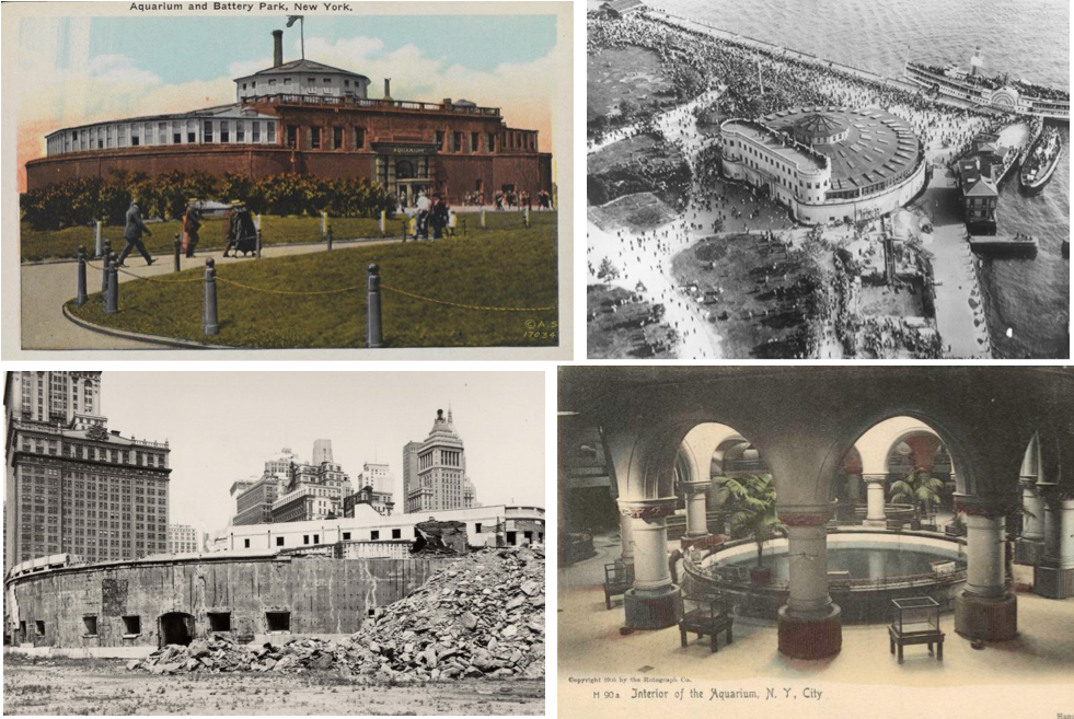
The aquarium was housed within the historic walls the South West Battery, constructed off the tip of Manhattan between 1808 and 1811 as a defense against the British. Renamed Castle Clinton in 1817 (in honor of former Mayor/Governor Dewitt Clinton), it was deeded to the city in 1823 to be used as an entertainment center. From 1855 to 1890 it served as an immigrant landing depot, then remodeled in 1896 (by the architectural firm McKim, Mead, and White) to become the popular New York City Aquarium.
FISH OUT OF WATER…Postcard image of the New York City Aquarium from the early 1900s; aerial view of the aquarium circa 1934; postcard image of aquarium interior; demolition of the aquarium in 1941, on orders from city planner Robert Moses. (thebattery.org/nycgovparks.org)
Although the aquarium proved to be a cultural and educational magnet, it stood in the way of master planner Robert Moses’s designs to build a bridge from The Battery to Brooklyn. After residents, preservationists and even Eleanor and President Franklin Roosevelt protested, the city opted instead to construct a tunnel under the East River. Nevertheless, Moses managed to get the aquarium knocked down before demolition was halted by the outbreak of World War II. After the war, Congress passed a bill declaring the site a National Monument, and preserved the walls of Castle Clinton.
HIGH AND DRY…Until it was demolished in 1941, the New York City Aquarium occupied the space in the center of Castle Clinton, which was added to National Register of Historic Places in 1966. (nps.gov)
* * *
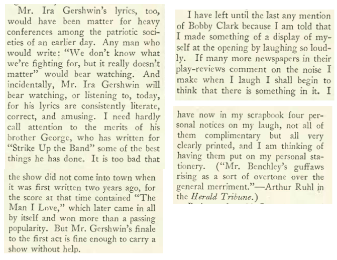
Now, About That Band…
A play that satirized America’s enthusiasm for war—Strike Up the Band—was loved by critics but spurned by audiences when it opened in Philadelphia in 1927. Written by George S. Kaufman, with music and lyrics by George and Ira Gershwin, the play had the pedigree for success, but audiences weren’t quite ready for a show that poked fun at the U.S. military just nine years after the end of World War I (in the original play, America is goaded into declaring war on Switzerland by an American cheese tycoon).
Enter lyricist Morrie Ryskind, who reworked the script, softening its political message and remaking the war plot into a dream sequence. The revised play proved to a be hit, running for 191 performances at the Times Square Theatre. It also introduced a number of popular songs, including “The Man I Love” and “Strike Up the Band.” Robert Benchley was on hand for opening night:
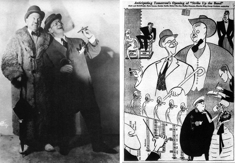
TEAMWORK…Clockwise, from top, Ira (left) and George Gershwin at work circa 1930; lyricist Morrie Ryskind, who softened the tone of George S. Kaufman’s original script. (U of Michigan/Wikipedia)
Benchley noted that the antics of comedian Bobby Clark caused him to laugh so loud that his guffaws were even noted in the Herald Tribune’s review:
MAKE ‘EM LAUGH…The comedy team of Paul McCullough (left) and Bobby Clark were one of the play’s big draws. At right, Herald-Tribune illustration by Al Hirschfeld announcing the Broadway opening of Strike Up the Band. (aaronneathery.org)
* * *
Duncan Yo-Yos
We’ve seen the Duncan Sisters (Rosetta and Vivian) before in this blog, the sister vaudeville act that became famous with the 1923 hit musical Topsy and Eva, which inspired a silent 1927 film starring the duo. They were back on the screen in late 1929 with It’s a Great Life, which TheNew Yorker’sJohn Mosher found to be “pretty dreary”…
NOT SO GREAT, THIS…Clockwise from top, promotional poster for It’s a Great Life; a scene from a dance number in the film; Rosetta (in blackface) and Vivian Duncan as Topsy and Eva (characters derived from the novel Uncle Tom’s Cabin). It’s a Great Life flopped at the box office, along with the Duncan’s brief movie careers. In the years to follow the duo would became popular nightclub entertainers and would continue to perform their Topsy and Eva routine even though appearing in blackface was increasingly considered offensive. (Wikipedia/freewebs.com)
* * *
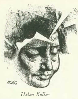
Miracle Worker
TheNew Yorker profile, written by Robert Coates, featured Helen Keller (with illustration by Hugo Gellert). A brief excerpt:
* * *
From Our Advertisers
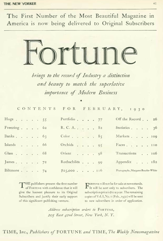
Advertisers in the Jan. 25 issue included the new Fortune magazine, which announced its first issue with this full-page ad:
…the table of contents is fascinating, spare in descriptions of everything from “Hogs” to “Orchids”…
From left, issue No. 1, February 1930; table contents for the issue; a prototype of the magazine, September 1929. (Fortune)
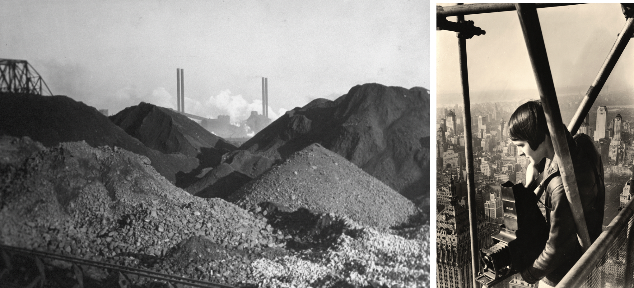
…also listed in the new magazine’s table of contents was the name of a 24-year-old photographer, Margaret Bourke-White…
A photo of coal piles by Margaret Bourke-White in the first issue of Fortune magazine. At right, Bourke-White photographing atop a skyscraper circa 1930. (Fortune)
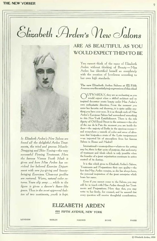
…on to our other advertisements, we have this entry from Elizabeth Arden…ads from this salon chain in the 1920s and 30s featured this ubiquitous image of a woman with a distant stare, her head tightly bound — mummy-like — as part of a firming treatment called “muscle-strapping”…
…in contrast to the rather cold, clinical look of the Elizabeth Arden ad, the Primrose House appealed more to social climbing than skin toning…
…while the makers of Pond’s cold cream continued to draw from their stable of debutantes and society ladies to move their product…
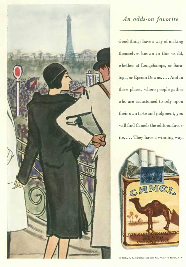
…long before there was Joe Camel, R.J. Reynolds also appealed to social climbers with a series of ads beautifully illustrated by fashion artist Carl Erickson…
…society’s smokers were advised to pack a tube of Bost toothpaste, or have their French maid do it for them…
…and once again we have an ad by Dr. Seuss for Flit insecticide that is very much of its time…
…as is this cartoon by Isadore Klein, perhaps the first in The New Yorker that depicted African Americans as something other than minstrel show stereotypes. Nevertheless, the rendering is still a bit crude — especially the boy’s face — as is the idea behind the “joke” — that a black boy could actually aspire to be a great violinist like Jascha Heifetz…
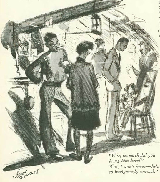
…John Reynolds explored a less troubling juxtaposition among the bohemian set…
…and we end with this peek into society life courtesy Barbara Shermund…
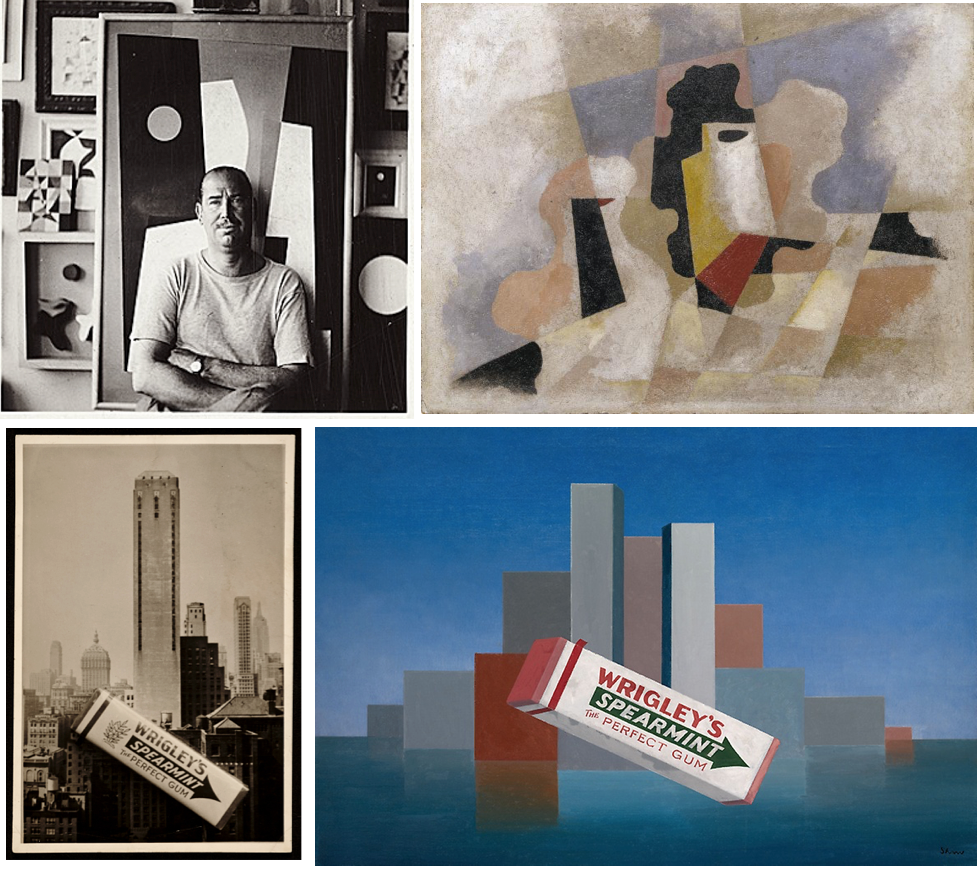
Some people really do lead charmed lives: Take for example Charles Green Shaw. Born to wealth, he was a fixture in the glamorous social scene of Jazz Age New York, but was also a key player in its intellectual and artistic life. An accomplished author as well as a poet and illustrator, Shaw turned to painting in his late thirties and became a leading figure in the world of abstract art.
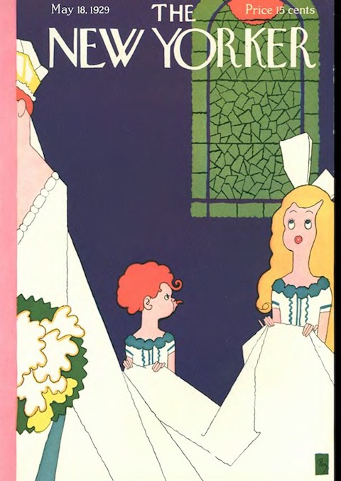
May 18, 1929 cover by Gardner Rea.
Shaw (1892-1974) was an early contributor to The New Yorker, penning more than thirty pieces for the magazine between 1925 and 1932, including three short contributions to the very first issue (Feb. 21, 1925). Here’s one of them:
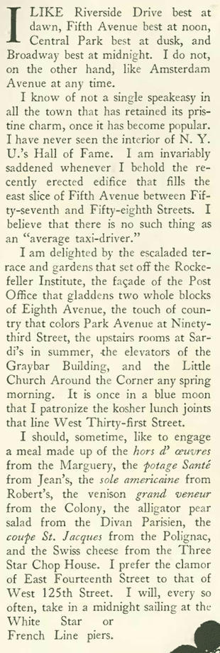
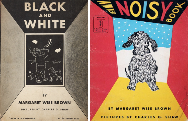
That short piece anticipated a much longer entry by Shaw four years later—in the May 18, 1929 New Yorker—in a column titled “How I Feel About Things.” An excerpt…
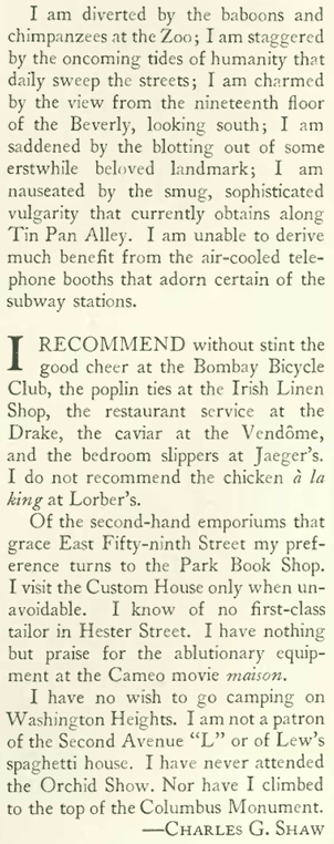
YEAH & MEH…Charles Shaw liked Central Park at dusk; Amsterdam Avenue, not so much. (Time Freeze Photos/NYC Municipal Archives)SOMETHING TO CHEW ON…Top left, Charles G. Shaw in 1945. Clockwise, from top right, Untitled Abstraction, 1943, oil on fiberboard; Wrigley’s,1937, oil on canvas; photo of Wrigley’s gum package on top of a postcard image of New York City. On the back of the photo Shaw had written “idea for montage.” (Wrigley painting courtesy Art Institute of Chicago/other images from Archives of American Art, Smithsonian Institution)
…one more excerpt from the Shaw column…
Shaw would contribute more columns to The New Yorker in this vein: four more titled “How I Feel About Things” (1929-1931) followed by “How I Look at Things in General” (1931), and his final two New Yorker columns (1931-1932), “Things I Have Never Liked.”
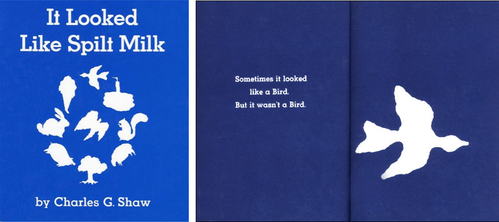
He also illustrated children’s books, including two by Margaret Wise Brown (of Goodnight Moon fame). In 1947, Shaw published It Looked Like Spilt Milk, a book that introduced children to abstract art. It remains in print and popular today.
SOMETHING FOR THE KIDS…Shaw provided illustrations for Margaret Wise Brown’sBlack and White (1944) and The Winter Noisy Book (1947). (Harper)STILL POPULAR…Shaw published It Looked Like Spilt Milk as a children’s introduction to abstract art. (Kinder Books)
* * *
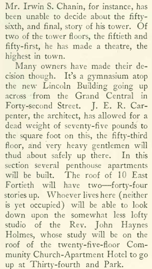
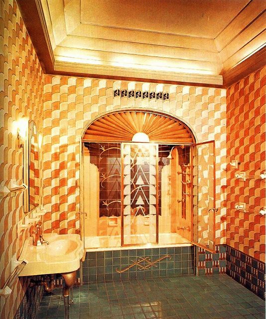
In the “The Talk of the Town,” James Thurber looked at “high-living” trends among occupants atop the city’s newest skyscrapers, including developer Irwin Chanin:
CROWN JEWELS…The Chanin Building at 122 E. 42nd Street sports a distinctive crown that contains a wraparound terrace (now closed) at the 56th floor. A theater on the 50th and 51st floors, just below Irwin S. Chanin’s executive suite, was later converted into office space.(aviewoncities.com/untappedcities.com)A THRONE IN THE SKY…The art deco bathroom in the 52nd floor executive suite of architect and real estate developer Irwin S. Chanin was designed by Jacques Delamarre. (Pinterest)AERIAL GYMNASTICS…1930s postcard image of the Lincoln Building at 60 East 42nd. At right, the building’s rooftop gymnasium. (nyc-architecture.com/Tony Hisgett)
…Thurber continued his survey downtown in the financial district, and noted the proliferation of “lanterns” atop various skyscrapers…
ALL THE RAGE…”Lanterns” of various styles were popular toppers to Jazz Age skyscrapers. Above, the 24-story Consolidated Gas Building (now the Con Edison tower) by day and night. (Architect/Office for Metropolitan History/Michael Falco for The New York Times)TRY TO TOP THIS…The distinctive lantern of the New York Central Building at 230 Park Avenue, now called the Helmsley Building (andrewcusack.com/Wikipedia)
* * *
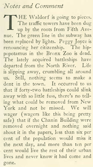
Waldorf Adieu, Part Two
For a second week “The Talk of the Town” led off with an item about the demise of the Waldorf-Astoria hotel, this time attempting to put it into some perspective…
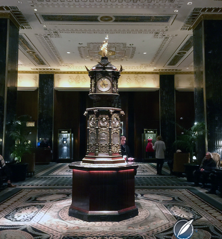
…and Charles Merz offered a lengthy account of the auctions that were already taking place at the hotel as everything from grand pianos (125 in all) to a nine-foot-tall, five-ton, bronze-and-mahogany clock either went on the block or into storage…
GOING, GOING…Illustration depicting an auction of items from the hotel. At right, the Waldorf’s nine-foot-tall, five-ton clock, shown here on display at the 1893 Chicago World’s Fair. A gift from Queen Victoria, the clock was acquired after the fair by John Jacob Astor IV, builder of the Astoria part of the old Waldorf-Astoria. He had it placed near the old hotel’s Rose Room restaurant. (Museum of the City of New York/Wikimedia)STILL TICKING…The clock as it appears today in the lobby of the new Waldorf-Astoria, which was completed in 1931. A gilded Statue of Liberty was added to the top of the clock in 1902, a gift from the French government. (Wikimedia/Elizabeth Doerr)
…Merz observed that although lavish tapestries, statuary, heavy furniture and other large items were up for sale, many buyers showed up merely to acquire a small memento…
IF THAT IS YOUR THING…Ornate furnishings (such as this French rococo-style furniture) were likely purchased at the auction by someone who actually had room for them. (Pinterest)
…Merz concluded that in the end, these “lesser treasures” will serve as props that will be handed down to the next generations, along with stories about the great and not-so-great who once slept or dined at the old hotel…
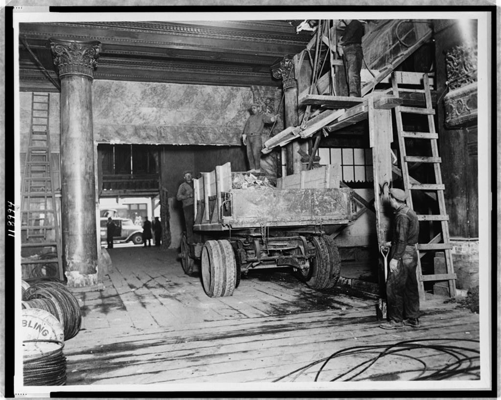
LAST DANCE…Workers emptying the old Waldorf-Astoria ballroom in 1929. (Library of Congress)
The May 18 issue featured yet another item on the Waldorf-Astoria — in “The Wayward Press” column, Robert Benchley (under the pseudonym “Guy Fawkes”) suggested that the story on the hotel’s demise had been milked for all it was worth….
* * *
The Algonquin Wits
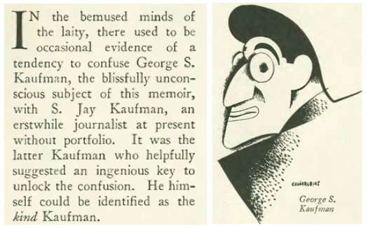
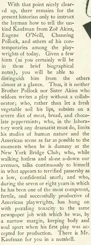
Speaking of milking a story, Alexander Woollcott playfully referenced his own material in the May 18 issue—indeed, quoting a profile he had written in the very same issue. Woollcott penned a humorous piece on friend and fellow Algonquin Round Table wit George S. Kaufman (caricature by Miguel Covarrubias). An excerpt:
…a bit later in the profile, Woollcott observed…
…a few pages later in the same issue, Woollcott offered more observations on his friend in his weekly “Shouts and Murmurs” column…quoting the above paragraph…
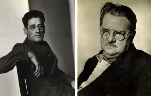
Kaufman would have his own say in 1939 with his hit play, The Man Who Came to Dinner (written with Moss Hart). The play’s main character, a cantankerous misanthrope named Sheridan Whiteside, was closely based on Woollcott.
SPARRING PARTNERS…George S. Kaufman and Alexander Woollcott often matched wits around the famed Algonquin Round Table. (Pinterest)OUT OF SORTS…The cantankerous misanthrope Sheridan Whiteside (a character based on Alexander Woollcott) was portrayed by Monty Woolley in the 1939 hit play, The Man Who Came to Dinner. The play was adapted into a 1942 movie with Woolley (left) reprising his role as Sheridan Whiteside. Playing opposite Woolley are Bette Davis (center) and Ann Sheridan. (oldhollywoodtimes.com)
What did Woollcott think of the treatment? According to an article featured in Story of the Week (Library of America), he loved it: “When the play went on its West Coast tour, he even stepped into the lead role, treating audiences to the sight of a celebrity acting as a satirical version of a character based on his own public persona. At the end of one performance, cheered on by repeated curtain calls, Woollcott riffed off one of his character’s signature lines from the play and announced to the audience that he planned to sue the authors for $150,000.”
Those were the days…
* * *
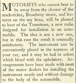
Distracted Drivers
In his “Motors” column, Nicholas Trott described a new gadget that could bring new levels of pleasure (or danger) to the driving experience: the car radio:
The Transitone was probably the first production car radio in the U.S., and looked something like this (left image):
VACUUM TUBES are exposed under the dash of this car (left) outfitted with a Transitone radio. At right, a Crosley car radio from 1931. (radiomuseum.org)
* * *
From Our Advertisers
The makers of Pond’s cold cream continued to land endorsements from the landed gentry, this time from 30-year-old Lady Violet Astor (née Violet Mary Elliot-Murray-Kynynmound, Dame of the Order of St. John), whose hair was described “as ripe as wheat,” her skin “pink and white as a hedge rose.” Okay, I’ll try a jar…
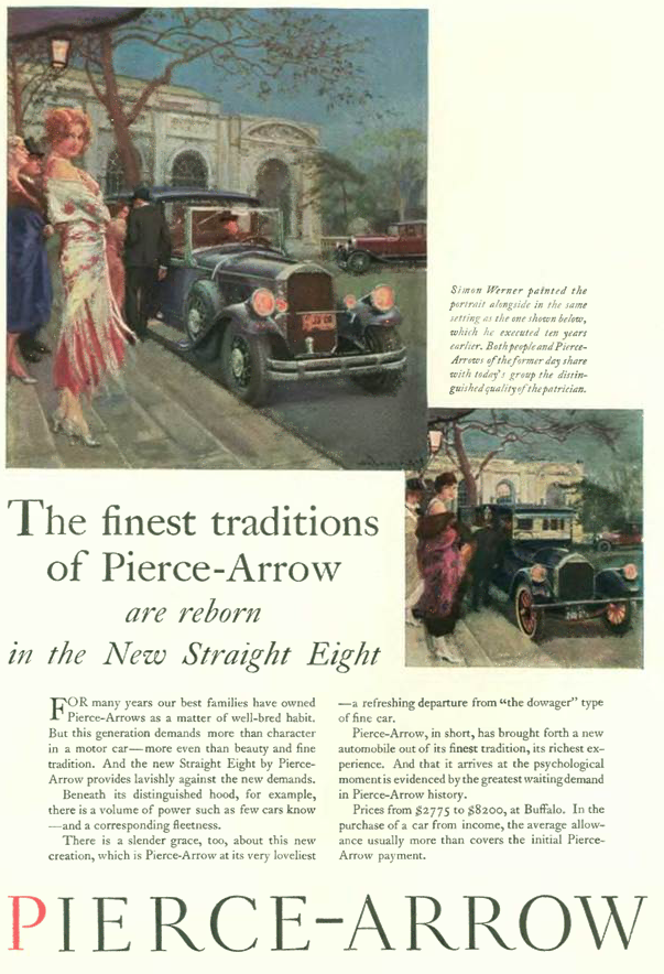
…and for more snob appeal, advertisements from American luxury carmaker Pierce-Arrow often featured messages that linked its cars to a lineage of earlier models, suggesting their automobiles had a well-bred, timeless quality (as opposed to the novelties found in cars driven by the plebeian classes). The caption reads: “Both people and Pierce-Arrows of the former day share with today’s group the distinguished quality of the patrician”…
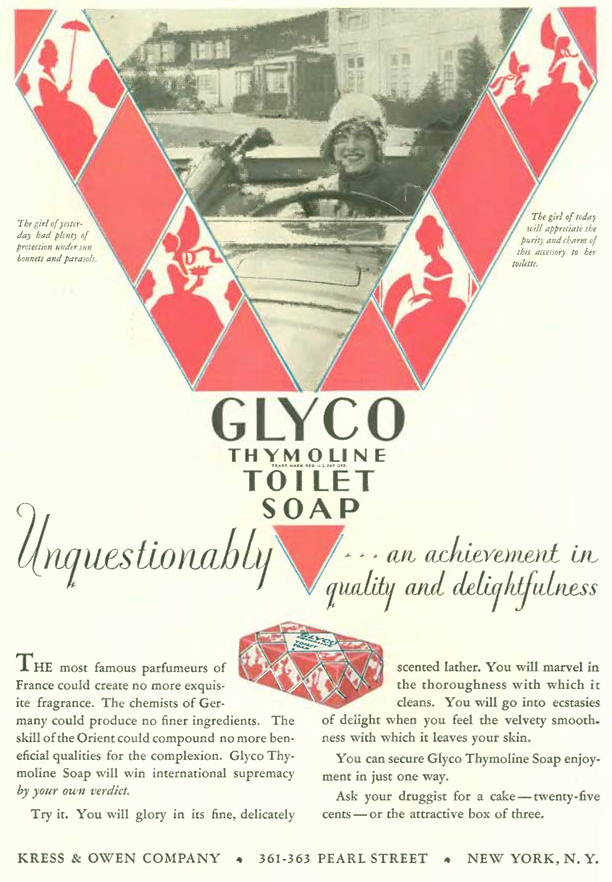
…the makers of Glyco “Thymoline” also drew upon the past to make a point about their soap, stating that “the girl of yesteryear had plenty of protection under sun bonnets and parasols,” whereas today’s young woman boldly races off to play golf without even bothering to put up the windshield. She’ll need Glyco to scrub off the bugs, dust and bits of gravel that will likely kick up into her face…
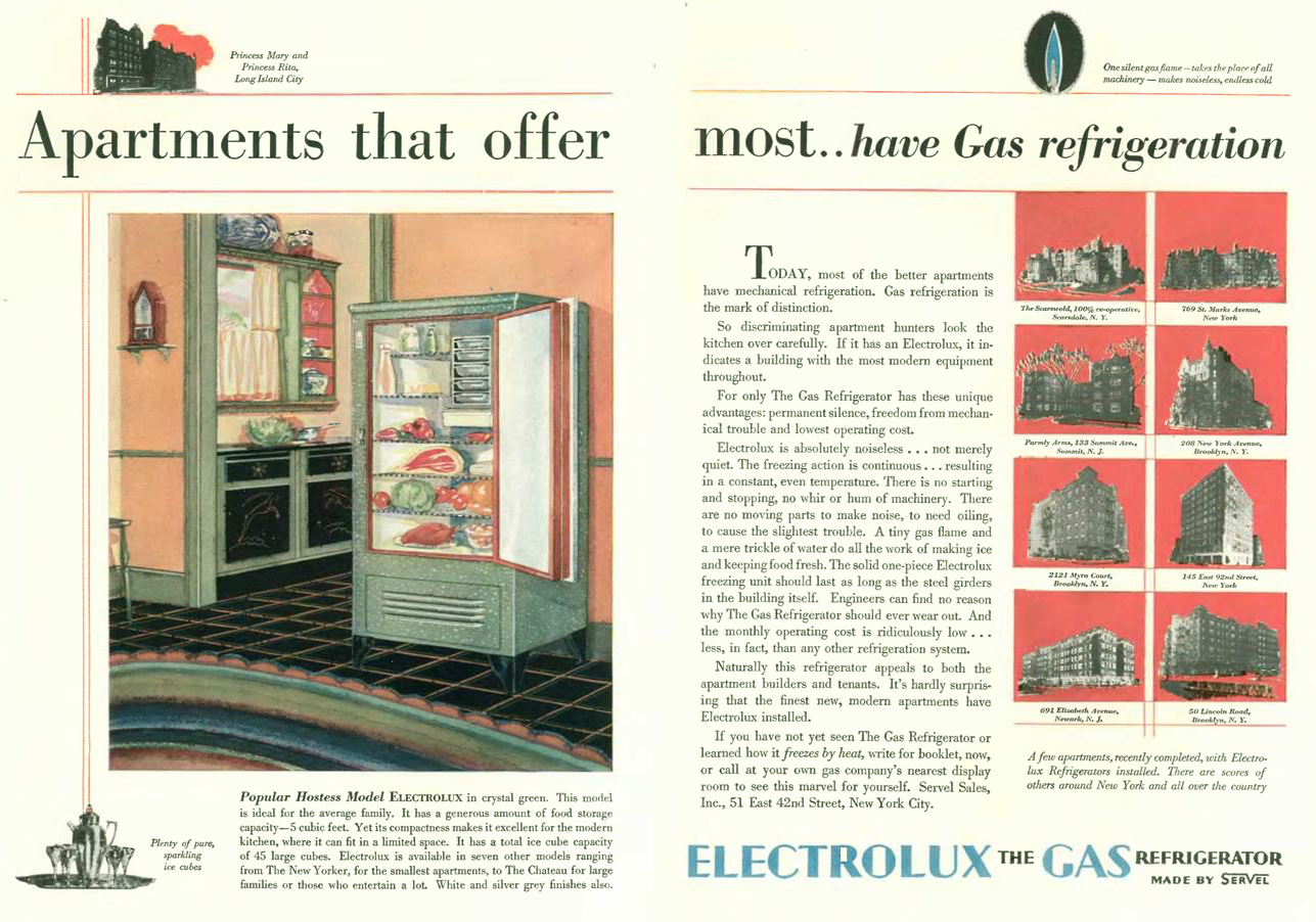
…One thing you notice at the end of the 20’s is the proliferation of color ads in The New Yorker, some quite lavish including this appeal from Electrolux, which depicted all of the new apartments popping up around the city powered by their gas appliances…
…and we have another lovely rendering by Carl “Eric” Erickson urging readers to smoke Camel cigarettes…
…and this ad caught my eye for its depiction of a house in the future, namely the year 1949 — you land your personal airplane on the roof and relax in your dynamic, angular furniture while a robot butler shakes up cocktails for you and your top-hatted friend…
…the house in the ad somewhat resembles this 1929 drawing by Swiss-American architect William Lescaze…
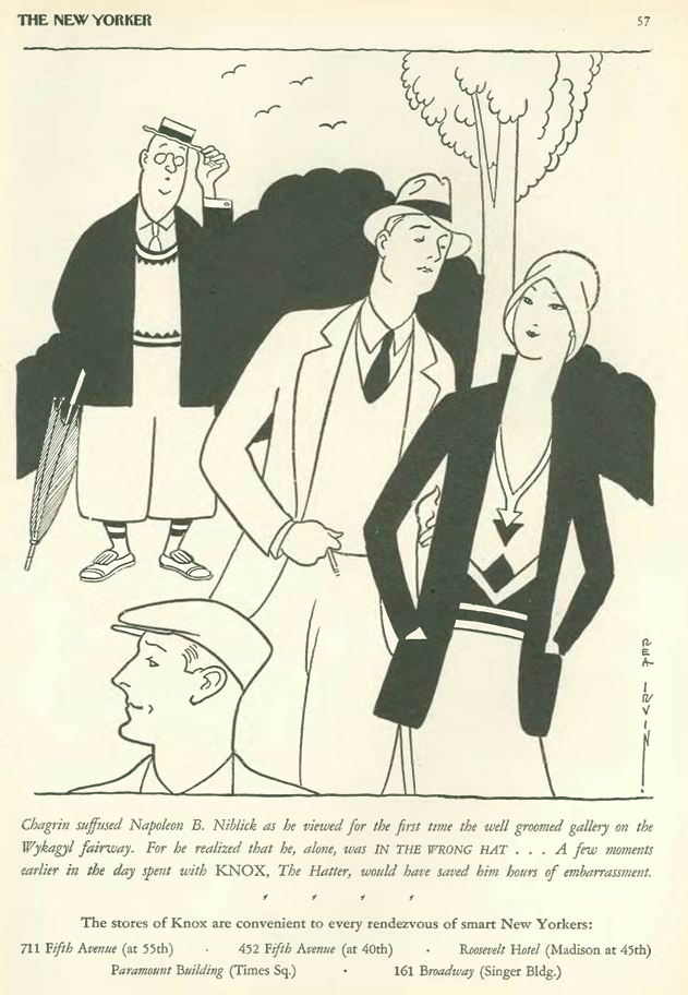
…we have another ad from Knox hatters (drawn by Rea Irvin) that featured an unfashionable, portly man (Napoleon B. Niblick) being snubbed by some Westchester toffs…