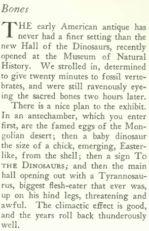
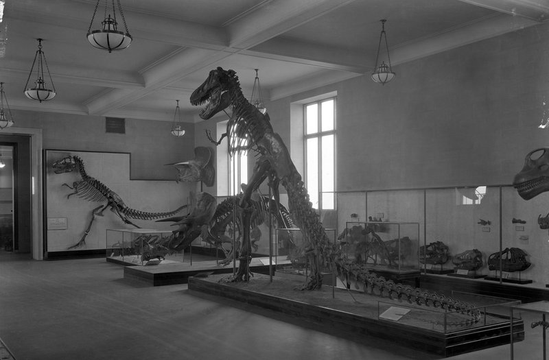
New York’s American Museum of National History unveiled its new Hall of Dinosaurs, and it was so impressive that even The New Yorker set aside its usual blasé tone toward popular attractions…
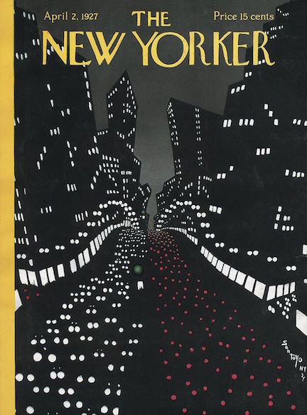
April 2, 1927 cover by Toyo San.
…and found its “Talk of the Town” editors to be quite taken with “sacred bones:”
NEW DIGS…Children studying a Brontosaurus skeleton in the American Museum of National History’s Hall of Dinosaurs, 1927. (AMNH Research Library)
Tyrannosaurus and Triceratops in the Hall of Dinosaurs, 1927. (AMNH Research Library)
* * *
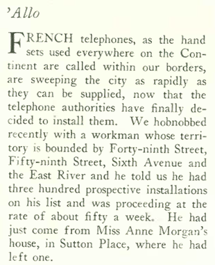
The April 2, 1927 issue also found New Yorkers to be agog over “French-style” telephones:
FRANCOPHONE…Trendy New Yorkers were switching from their old reliable candlestick telephones (left) to “French-style” phones (center) that were common throughout Europe. Western Electric answered their call with a sleek American version in 1928, right.
* * *
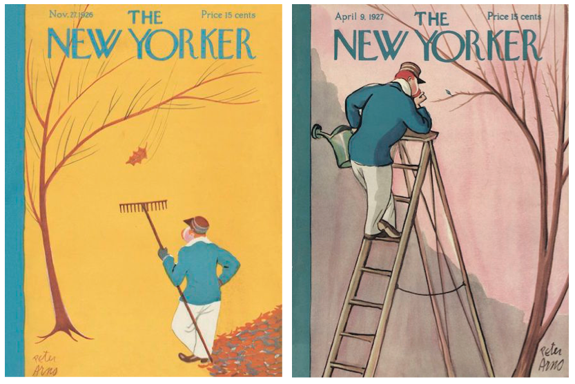
The April 9, 1927 issue featured the second of Peter Arno’s 99 covers for the New Yorker. His first cover appeared eighteen issues earlier (Nov. 22, 1926) and featured the same gardener, but this time he was inspecting a newly budded leaf rather than the last one to fall:
Note the difference in style between the two covers–the April 9 cover is rendered with more detail, depth and texture. These would be Arno’s only covers with rather sedate subjects. Subsequent covers would have more action and humor, such as this one from 1954, one of my favorites:
* * *
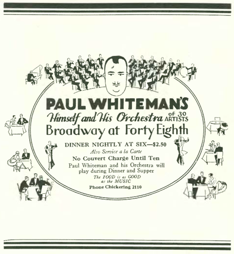
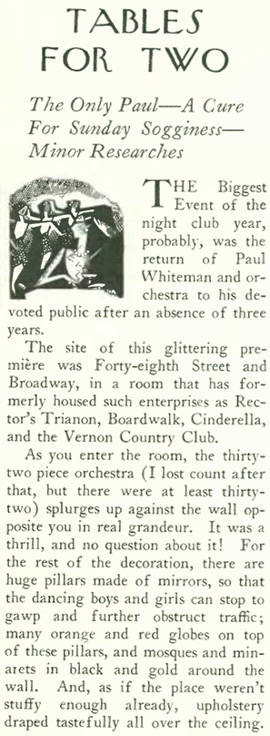
And now for a note about Paul Whiteman. One cannot write about the Jazz Age without mentioning the Paul Whiteman Orchestra. It was Whiteman who in 1924 commissioned George Gershwin’sRhapsody in Blue, which premiered with Whiteman’s orchestra (and with Gershwin himself at the piano).
This ad in the Feb. 26, 1927 New Yorker announced the much-anticipated return of Paul Whiteman and his orchestra. The caricature of Whiteman was his trademark.
Even Lois Long, who seemed to be growing bored with New York nightlife, found reason to celebrate Whiteman in this column that appeared alongside the ad:
Whiteman had 28 number one records during the 1920s and dominated sheet music sales. He provided music for six Broadway shows and produced more than 600 recordings. Dubbed “King of Jazz” his style was actually a blending of jazz and symphonic music.
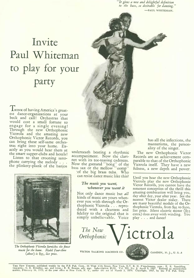
The folks at Victor Talking Machines played on Whiteman’s fame with this advertisement for their latest “Orthophonic” Victrola. Although it was the first consumer phonograph designed specifically to play “electrically” recorded discs and was recognized as a major step forward in sound reproduction, the claim that the machine would reproduce sounds “exactly as you would hear them at the smart supper clubs” seemed a little far-fetched.
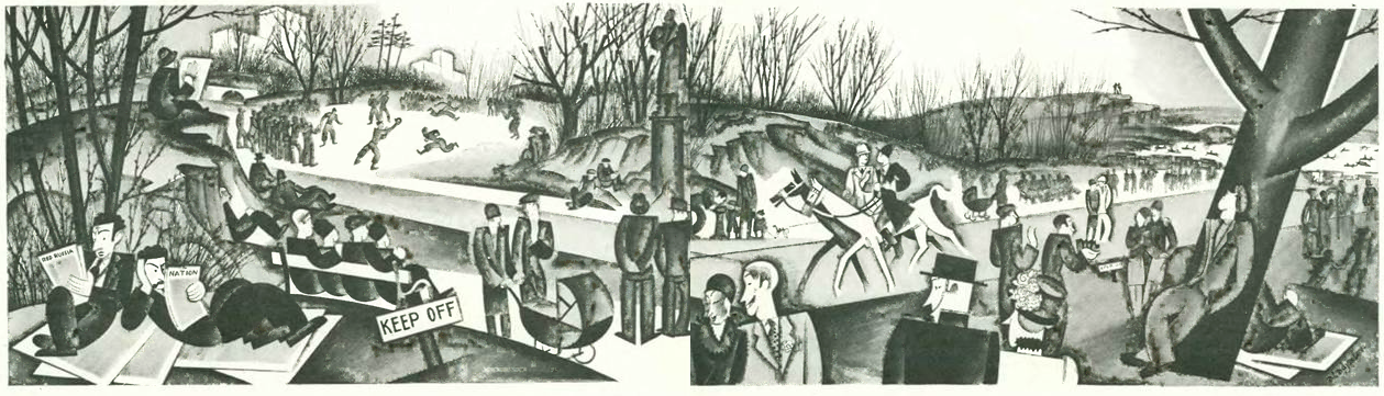
And finally, in celebration of spring, Constantin Alajalov illustrated an April day in Central Park, which was featured in a two-page spread in “Talk of the Town.”
Despite Prohibition, perhaps a few champagne corks were popped for the January 15, 1927, edition of the New Yorker. This is Issue # 100.
January 15, 1927–Issue # 100. The cover art by Constantin Alajalov.
Prohibition was on the minds of the editors of the issue, which featured a highly critical piece by Morris Markey (“A Reporter at Large”) on the hysteria surrounding the government’s attempt to poison supplies of bootleg alcohol. The editors of “The Talk of the Town” also made this observation:
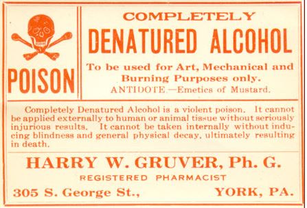
Before we get more into Markey’s piece, a little background is in order. In an article for Time magazine (Jan. 14, 2015) Lily Rothman writes that for years prior to Prohibition industrial alcohol had been “denatured” by adding toxic or unappetizing chemicals to it. This was done so folks couldn’t escape beverage taxes by drinking commercial-use alcohol instead — but it was still possible to re-purify the liquid so that it could be consumed.
HOME CHEMISTRY KIT…A bootlegger at work in the 1920s. (oldmagazinearticles.com)
Rothman cites a Time article from Jan. 10, 1927, which reported that Prohibition forces in the government were introducing a new formula that year for denaturing industrial-grade alcohol that doubled the poisonous content: “4 parts methanol (wood alcohol), 2.25 parts pyridine bases, 0.5 parts benzene to 100 parts ethyl alcohol.” The article noted that “Three ordinary drinks of this may cause blindness.”
Warning label from the 1920s (vickyloebel.com)
Although some opposed the practice as legalized murder, Rothman cites Seymour M. Lowman, who as Assistant Secretary of the Treasury (1927-33) was in charge of Prohibition enforcement. Lowman told citizens that those on the fringes of society who continued to drink were “dying off fast from poison ‘hooch’” and that if the result was a sober America, “a good job will have been done.”
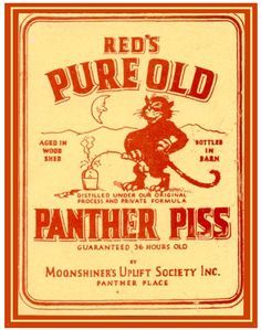
DRINK AT YOUR OWN RISK…1920s label for bootleg moonshine. (googleuk)
Thousands died from consuming poisoned alcohol. Rothman writes that 33 people died in Manhattan alone in a three-day period in 1928, mostly from drinking wood alcohol.
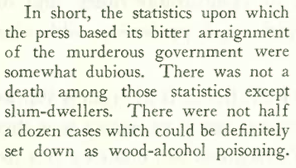
Markey’s stance in his New Yorker article is somewhat unique, if not cold-hearted. Instead of taking the government to task for the practice, he assured his well-heeled readers that they had nothing to fear as long as they procured their alcohol from reputable bootleggers at top prices. Markey seemed to care not at all for the poor “slum-dwellers” who died from consuming the cheap stuff:
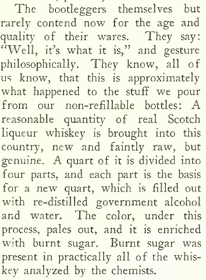
If anything, Markey’s sympathies seemed to lie with those who had to drink the safe, albeit diluted hootch. He explained how four bottles of bootleg Scotch could be fashioned from a single bottle of the real deal:
And if you had money, there was no need to fear death from drink…
…that is, unless you were careless:
* * *
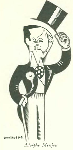
Helena Huntington Smith wrote a profile on the actor Adolphe Menjou, described by IMDB as Hollywood’s epitome of suave and debonair style: “Known for his knavish, continental charm and sartorial opulence, Menjou, complete with trademark waxy black mustache, evolved into one of Hollywood’s most distinguished of artists and fashion plates, a tailor-made scene-stealer.” Interestingly, Menjou was born in Pittsburgh, and not in France as many a fan assumed (his father, however, was a French émigré).
Glass lantern advertising slide for Adolphe Menjou’s 1927 silent film A Gentleman of Paris.
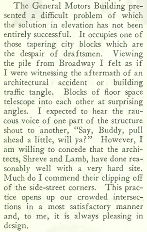
In other items, New Yorker architecture critic George S. Chappell (aka T-Square) once again set his sights on the city’s changing skyline. He began with the new General Motors building at Columbus Circle:
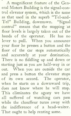
He was thrilled by the push-button automation of the building’s elevators:
The General Motors building, left, as it originally appeared on Columbus Circle. It was designed by Shreve & Lamb, who would soon go on to design the Empire State Building. At right, the building became known as the Newsweek Building. (Drawing by J. W. Golinkin in Towers of Manhattan, 1928, and photo by David W. Dunlap/The New York Times)
If Chappell thought the General Motors building had some issues in 1927, he should see it today, wrapped in tacky reflecting glass and renamed 3 Columbus Circle:
WHY? WHY ON EARTH? (nyc-architecture.com)
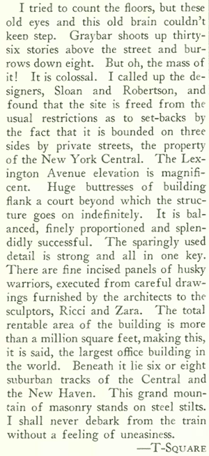
Elsewhere, Chappell was agog at Sloan & Robertson’s massive Graybar Building:
Sloan & Robertson’s Graybar Building at 420 Lexington. (history.graybar.com)
And to close, this ad on the back page for Chesterfield cigarettes, featuring the company’s famous Atlantic City sign. Note the point of pride: “There are 13,000 lamps” in the sign, but four times that many Chesterfields are smoked every minute…koff…koff…
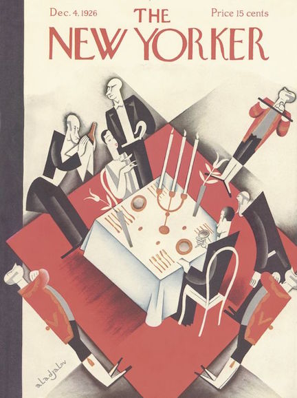
Ben Hecht was a well-known screenwriter, director, producer, playwright (notably, The Front Page) and journalist who contributed a number of comic essays to The New Yorker, including “The Caliph Complex” featured on Page 30 of the Dec. 4, 1926 issue.
December 4, 1926 cover by Constantin Alajalov.
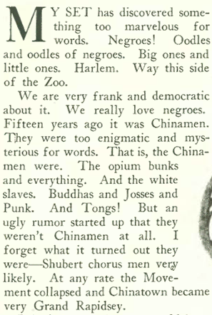
The magazine consistently rejected “uptown slumming” by New Yorkers seeking exotic thrills in Harlem nightclubs (see my recent post on nightlife correspondent Lois Long’s ho-hum attitude toward the Cotton Club), and Ben Hecht was no exception to this stance.
A drawing by Julian De Miskey that accompanied Hecht’s article.
In her book Defining New Yorker Humor, Judith Yaross Lee suggests that Hecht’s criticism of “slummers” was not an act of political liberalism, but rather was in line with the magazine’s habit of poking fun at the faddish. Hence the opening lines of Hecht’s essay:
As I’ve previously noted, for all its sophistication The New Yorker of the 1920s was decidedly mainstream in treating blacks as racial “others.”
Lee notes that only a few illustrations in the magazine’s first five years depicted Asians, and the servant class was mostly represented by European types (butlers with a Jeeves-like air, or comely chamber-maids).
Ben Hecht (Wikipedia)
When it came to depictions of black and brown faces, Lee notes that the magazine featured “conventional” types of the day—minstrel figures in blackface (see illustration above) or exotic African dancers.
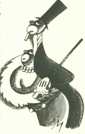
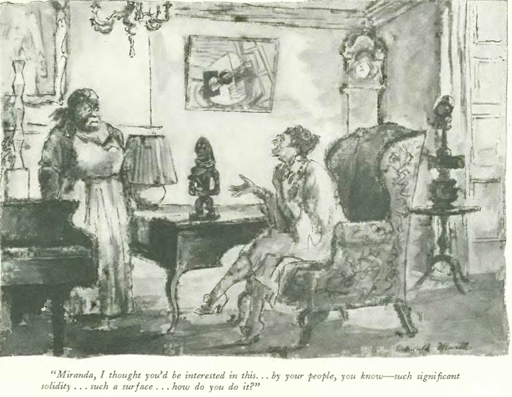
When blacks were depicted as servants, they were rendered as “mammies,” such as in this cartoon by Reginald Marsh in the Dec. 4 issue:
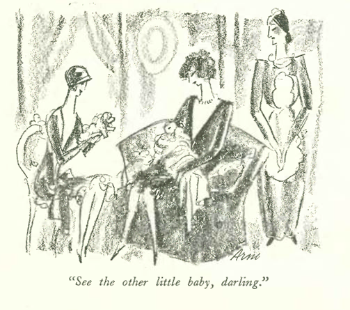
On the facing page, Peter Arno offered a depiction of a servant more typical for the magazine:
But lest we feel smug in looking down at our literary forebears, the current discourse in our country seems to indicate that we still have a long way to go on issues of race.
Although there is much to dislike about The New Yorker’s views on race 90 years ago, its criticism of faddish “slumming” did call into question 1920s notions of race. Lee notes that the cartoon by Reginald Marsh (above) is actually a sneer aimed at the white woman for her patronizing comment. She represented the “fashionable Afrophilia” that Hecht and his fellow New Yorker writers detested.
“The Caliph Complex,” according to Lee, “suggested that The New Yorker did not so much ignore Africanist movements as suspect their white supporters.” The following October, Dorothy Parker would pen the essay “Arrangement in Black and White”–the story of a party in honor of a famous gospel singer–that would echo Hecht’s attack on false liberalism.
Although architectural criticism was practiced by a rare few in 1926 (and even fewer today), it was prominent in the pages of The New Yorker. Lewis Mumford famously served as the magazine’s critic from the 1930s to the 1950s, and longtime critic Paul Goldberger took over the magazine’s “Sky Line” column from the mid-90s to 2011.
October 16, 1926 cover by Constantin Alajalov.
In 1926 George S. Chappell served the magazine as architecture critic under the pseudonym “T-Square.” A rare combination of architect, parodist, and journalist, he was perhaps best known for his travel series parody published under the pseudonym “Walter E. Traprock.”
In the Oct. 16, 1926 issue, Chappell took critical aim at the “cheap architecture” sprouting amidst the clamor of a rapidly changing landscape…
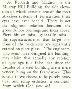
…and referred to the fenestration (the arrangement of windows and doors) of the Murray Hill Building as “atrocious.”
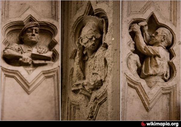
The Murray Hill Building. (Museum of the City of New York)The ground-floor show windows of Murray Hill feature free-hand carvings depicting people in various trades. (Wikimapia)
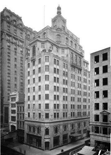
Chappell then set his sights on “another disappointment,” the Delmonico Building, which he said possessed “the grace of an overgrown grain elevator…”
Part of Chappell’s disgust is no doubt attributable to the fact that the beloved old Delmonico Building at Fifth Avenue and 44th Street (left, photo from The Brickbuilder, 1899), was razed in 1925 and replaced by the “overgrown grain elevator” at right. (Google Maps screen image)
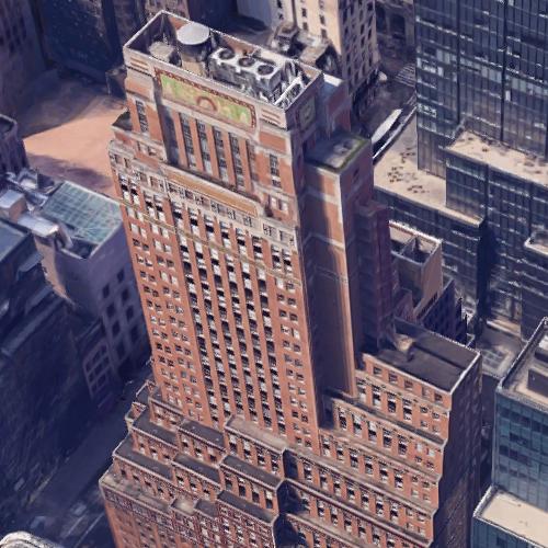
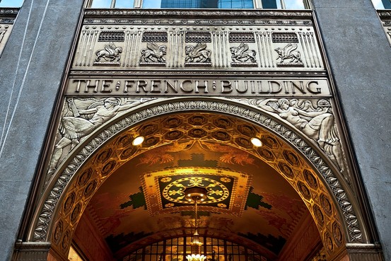
He then moves on to the landmark French Building with its “dreary factory windows”…
The French Building. (Google Maps)The 5th Avenue entrance to the French Building. (omnidisc)
So what did Chappell prefer? Read on…
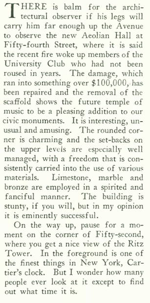
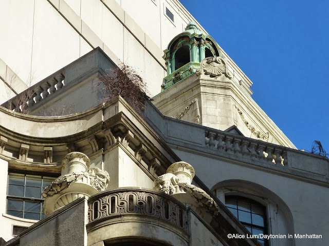
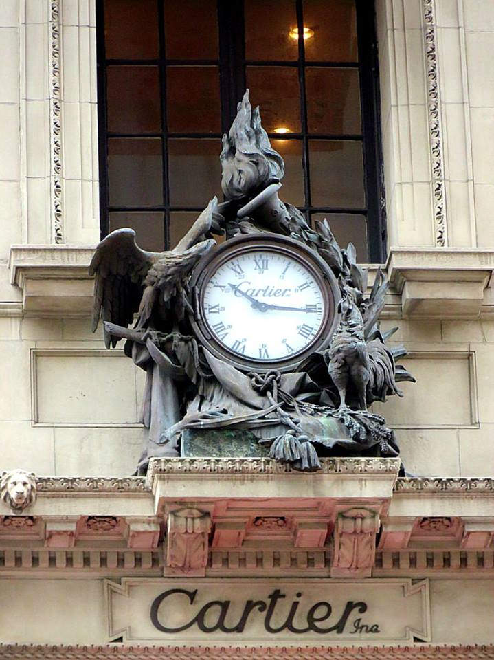
Aeolian Hall on Fifth Avenue, constructed on a site formerly occupied by the William Rockefeller mansion. (Museum of the City of New York)Detail of the upper stories of Aeolian Hall. (Daytonian in Manhattan)Cartier’s clock on Fifth Avenue (Pinterest)
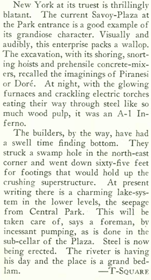
Despite Chappell’s oft disapproving gaze, in the end he (along with other editors and writers at The New Yorker) could not help but be caught up in the thrill of one of the city’s grandest building booms…
Other items of note in the Oct. 16 issue, this ad promoting the first-ever “New Yorker book,” a collection of “Profiles” by Waldo Frank, who wrote under the pen name “Search-light”…
And finally this picturesque ad for Marmon automobiles. The company was defunct by 1933.
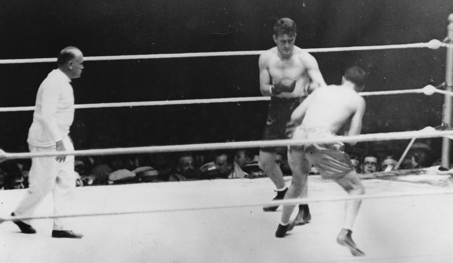
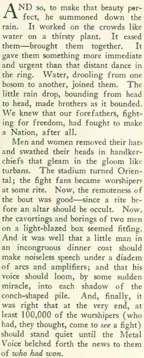
We skip ahead to the Oct. 2, 1926 issue to look at one of the big events of that year–the Dempsey-Tunney heavyweight prize fight (I’m not skipping issues…Sept. 25 appears later in this blog).
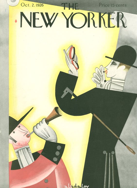
Oct. 2, 1926 – Issue # 85 – Cover by Constantin Alajalov. (Once again, note the ongoing comic reference to androgyny in 20’s fashion)
Heavyweight boxing was a big part of the American sports scene in the 1920s, and two giants of the sport, Jack Dempsey and Gene Tunney, dominated the headlines in the late 1920s thanks to much-heralded bouts in Philadelphia in 1926 and a rematch in Chicago the following year (which would include the famous “long count” incident).
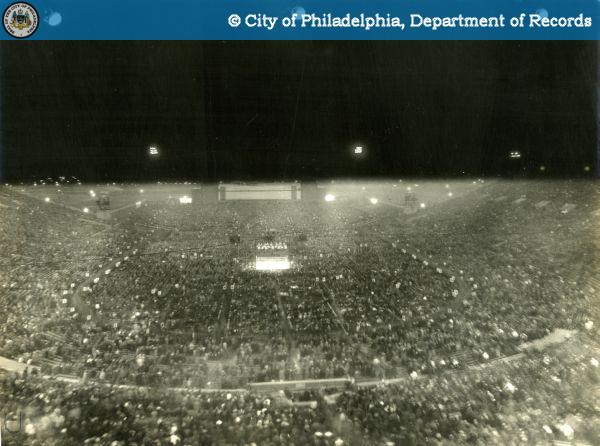
An estimated 135,000 fans packed Sesquicentennial Stadium in Philadelphia for the Dempsey-Tunney bout. (NYTimes)
The New Yorker joined in on the hoopla, publishing a lengthy account of the match by Waldo Frank (aka “Search-light”), who trained his jaded eye on the whole affair:
VIEW FROM THE CHEAP SEATS…a rain-soaked throng at the Dempsey-Tunney fight in Philadelphia. (City of Philadelphia)
According to the New York Times, the crowd included such notables as Charlie Chaplin, cowboy movie star Tom Mix and the English Channel swimmer Gertrude Ederle.
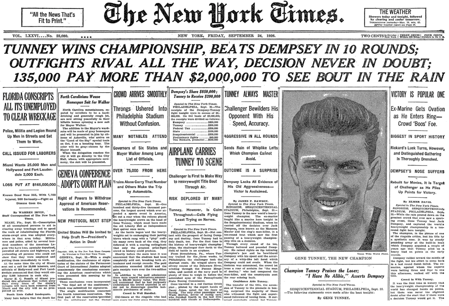
Coverage of Tunney’s victory by unanimous decision took up three-quarters of the front page of The New York Times, and also filled most of pages 2 through 7. (The New York Times)
But in typical fashion, Waldo was less than dazzled, finding the rain an apt metaphor for a spectacle mostly unseen by those in attendance:
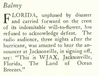
Never one to wallow in tragedy, the magazine made a brief (and oddly droll) reference in “The Talk of the Town” to a hurricane that hit Miami and its environs (it killed 372 people and injured more than 6,000):
Other items of note in the issue included this examination of country vs. city life by cartoonist Barbara Shermund…
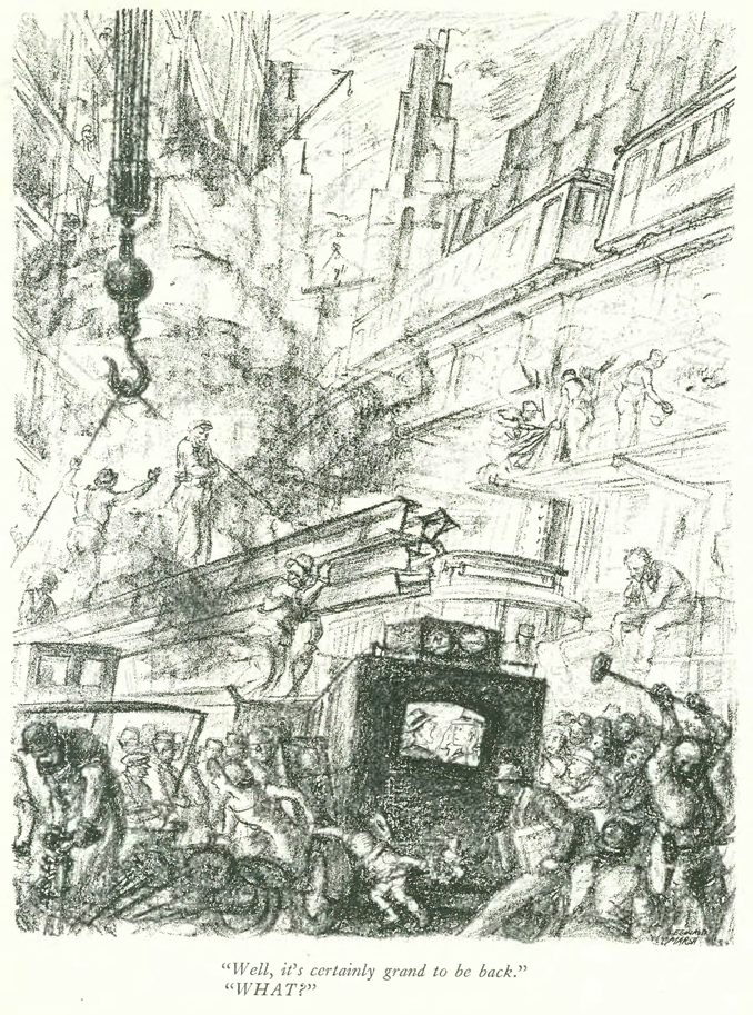
…and this cartoon by Al Frueh commenting on the challenges of Manhattan’s rapidly changing cityscape:
The changing city was also on the mind of Reginald Marsh in this illustration he contributed to the Sept. 25, 1926 issue of the magazine:
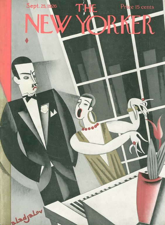
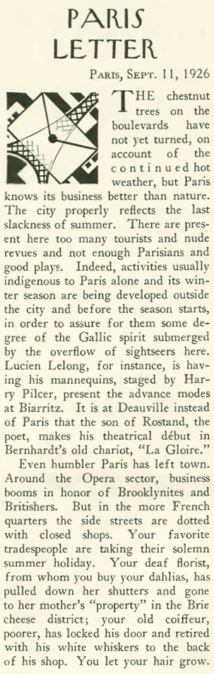
Back to the Sept. 25 issue, which featured an update from Paris correspondent Janet Flanner…
Sept. 25, 1926 – Issue # 84 – Cover by Constantin Alajalov.
…who commented on the large number of American tourists crowding the city just as the locals were fleeing for their long, late summer holidays:
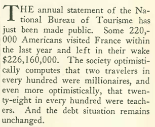
She offered some numbers to back up her observations:
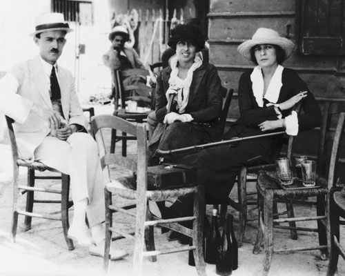
Janet “Genêt” Flanner (right) and longtime companion Solita Solano (center) in Paris, 1921. Solano was a well-known writer and drama critic for the New York Tribune. (Vintage Everyday)
And finally, a cartoon by Rea Irvin exploring the trials of the idle rich: